Goal:
Use existing facility capacity more efficiently and increase transportation options.
Objectives:
The transportation system in the Boston region is, to a certain extent, increasingly stressed by the overall growth and success of the region’s economy. Congestion on the region’s roadways is reducing vehicular speeds, while the transit system is strained by high ridership and an aging infrastructure. Usage of the transportation network, both the roadway and transit systems, is projected to increase more during the time period covered by the Boston Region Metropolitan Planning Organization’s (MPO) next Long-Range Transportation Plan (LRTP), Destination 2040. In pursuit of the MPO’s core goals, the MPO and other stakeholders must find a way to manage the network’s capacity with limited capital funding to maximize mobility for all residents and users of the transportation network, including bicyclists and pedestrians.
Transportation capacity in a metropolitan region has important ramifications for the region’s economic health and quality of life, both in the present and the future. As the data and analysis presented in this document demonstrate, the Boston region confronts a sort of policy paradox: a booming economy and a rapid population growth—especially in the core of the region—paired with increasing congestion and a public transit system that is aging and unreliable. These factors combine to stress the transportation network’s overall capacity, creating significant challenges to convenient mobility across all modes for the residents and users of the MPO area’s transportation network. Awareness of the stress on the system appears to be rising among the media and the public, and pressure on policymakers to restore mobility may be on the rise.1
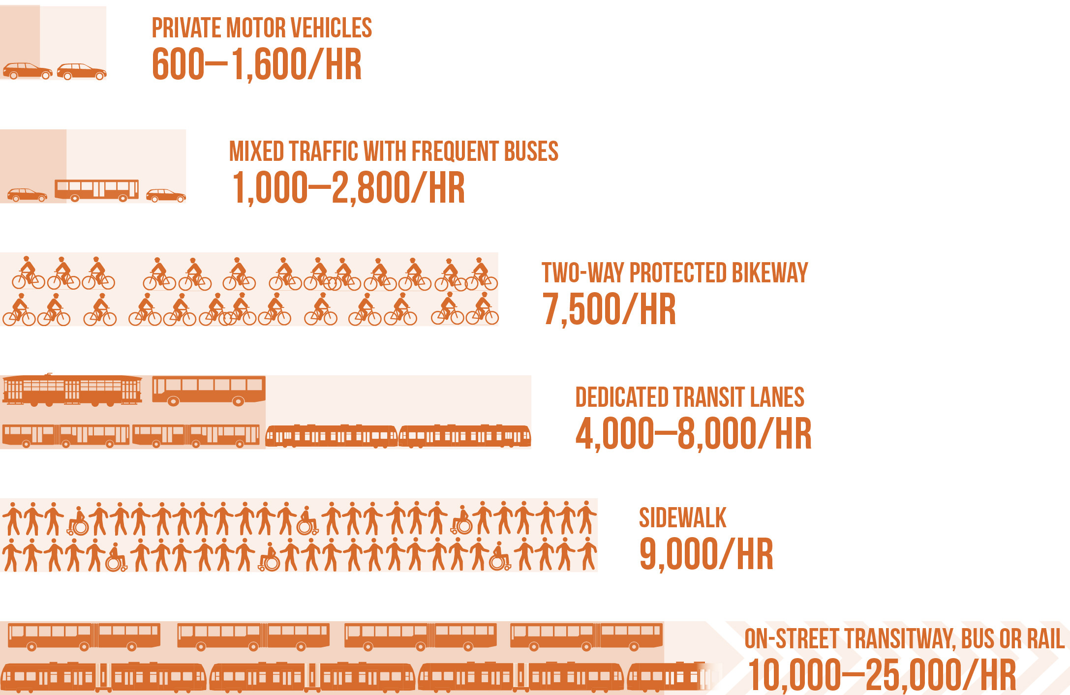
The MPO’s capacity management and mobility goal and objectives seek to expand users’ travel options to reach principal destinations. They respond to federal, state, and regional policies and activities to increase transit, bicycle, and pedestrian travel, and to the increasing demand for transit, bicycle, and pedestrian connections by communities throughout the region. With limited finances for expansion, the MPO needs to work with other responsible agencies and entities to address the challenge of setting policy and priorities to create as much capacity as possible from the existing system. As studies and analyses by the MPO and other agencies have shown, in many situations, the least technically complex and least capital-intensive path to creating additional overall network capacity is to reallocate space on the existing road network to the modes that have the capacity to move the highest possible number of users in a given space. Figure 6-1 demonstrates this dynamic for a typical city street.
Figure 6-1
Overall Person Throughput Capacity of a Typical Lane by Mode
Source: National Association of City Transportation Officials (NACTO) Transit Street Design Guide, https://nacto.org/publication/transit-street-design-guide/introduction/why/designing-move-people.
MPO staff identified the following key factors that will affect the MPO’s Capacity Management and Mobility goal area in the future. These factors are consistent with key challenges that have been identified in the report, Choices for Stewardship: Recommendations to Meet the Transportation Future, released in December 2018 by the Commission on the Future of Transportation in the Commonwealth—a high-level report intended to guide the future of transportation policy and planning in Massachusetts. These key factors include:
One of the major challenges facing the MPO and other policymaking stakeholders and agencies is the preservation and enhancement of mobility options when economic growth and trip-making are concentrated in a limited geographic area. Economic growth in the Boston region outpaces that in the rest of the state, and growth in the Inner Core subregion is projected to continue at a faster rate than in the rest of the Boston region. The increase in the number of trips made in the Boston region is increasing congestion on a network that is either at capacity or nearing it. In an area where adding roadway capacity for vehicles is challenging, the MPO and other policymaking entities have the opportunity to work with municipalities to reallocate road space to accommodate all modes of travel.
The regional transit system has also been stressed over the past several years, and continues to struggle by some measures. The Massachusetts Bay Transportation Authority (MBTA) has plans and capital projects underway to modernize and increase capacity on much of the rapid transit system. The MBTA recently conducted the Better Bus Project which proposed changes to bus service based on research and partnerships with municipalities. This project and potential MPO and municipal projects and programs provide an opportunity to improve the reliability, capacity, and quality of the bus network with a relatively low capital expenditure. The MBTA has also launched the Rail Vision study to examine the future of the commuter rail network, a topic which MPO staff heard discussed many times during public outreach events.
Table 6-1 summarizes key findings regarding capacity management and mobility needs that MPO staff identified through data analysis and public input. It also includes staff recommendations for addressing each need. Chapter 10—Recommendations to Address Transportation Needs in the Region—provides more detail on each of the recommendations. The MPO board should consider these findings and recommendations when prioritizing programs and projects to receive funding in the LRTP and Transportation Improvement Program (TIP), and when selecting studies and activities for inclusion in the Unified Planning Work Program (UPWP).
Table 6-1
Capacity Management and Mobility Needs in the Boston Region Identified through Data Analysis and Public Outreach and Recommendations to Address Needs
| Emphasis Area |
Issue |
Needs |
Recommendations to Address Needs |
|---|---|---|---|
Roadway |
Congestion and slower speeds |
Address congestion on expressways, interchanges, and arterials. |
Existing Programs Major Infrastructure Program Bottleneck Program Freight Program Existing Studies Addressing Priority Corridors from the LRTP Needs Assessment Addressing Safety, Mobility, and Access on Subregional Priority Roadways Low-Cost Improvements to Express Highway Bottlenecks Proposed Studies Congestion Pricing Research Safety and Operations at Selected Intersections |
Roadway |
Bottlenecks |
Reduce congestion at bottleneck locations on the regional roadway network. |
Existing Programs Major Infrastructure Program Bottleneck Program Existing Study Low-Cost Improvements to Express Highway Bottlenecks Proposed Study Congestion Pricing Research |
Roadway |
Connected and autonomous vehicles |
Continue to monitor this technology because the schedule for its adoption and implementation, and its implications remain highly uncertain. |
Existing Study Tracking of Emerging Connected and Autonomous Vehicle Technologies |
Roadway |
Ride-hailing and TNCs |
Continue to monitor growth in TNC usage to determine if TNCs are diverting ridership and funds away from public transit, and contributing to congestion. The future of this mode is uncertain. |
Existing Program Community Transportation Program Proposed Program Connect Elderly Adults with Transportation Options Existing Studies Transportation Access Studies of Commercial Business Districts New and Emerging Metrics for Roadway Usage The Future of the Curb Proposed Studies Congestion Pricing Research Transit Revenue Analyses Research on TNCs Monitor TNC Adoption |
Roadway |
Car sharing |
Continue to monitor car sharing; it is poorly integrated with other modes and not accessible in all areas. The future of this mode is uncertain. |
Existing Program Community Transportation Program Proposed Program Coordinating Car Sharing and Transit |
Roadway |
Transportation demand management |
Continue to monitor TDM services. There is no region-wide strategy for TDM and relatively few municipalities in the Boston region have TDM ordinances. |
Existing Program Community Transportation Program Proposed Study Congestion Pricing Research |
Freight |
Congestion |
Reduce congestion on regional roadways to facilitate the movement of freight. |
Existing Programs Freight Program Major Infrastructure Program Bottleneck Program Proposed Programs Freight Database Existing Studies Addressing Priority Corridors from the LRTP Needs Assessment Addressing Safety, Mobility, and Access on Subregional Priority Roadways Low-Cost Improvements to Express Highway Bottlenecks New and Emerging Metrics for Roadway Usage Updates to Express Highway Volumes Charts Proposed Study Congestion Pricing Research |
Freight |
Contested curb and arterial road usage |
Reduce conflicts between automobiles and delivery trucks that are competing for curb space. |
Existing Studies Transportation Access Studies of Commercial Business Districts The Future of the Curb |
Freight |
Lack of data |
Develop reliable data sets on various freight topics. |
Existing Program Freight Program Proposed Program Freight Database |
Transit |
Access to transit |
Improve access to transit service that runs frequently, and increase capacity at park-and-ride lots that are at or approaching capacity. |
Existing Programs Park-and-Ride and Bicycle Parking Programs Regional Transit Service Planning Technical Assistance Community Transportation Program Proposed Programs Dedicated Bus Lane Program Enhanced Park-and-Ride Program Infrastructure Bank or Demonstration Materials Library Coordinating Car Sharing and Transit Existing Studies Transportation Access Studies of Commercial Business Districts Reverse Commute Areas Analysis The Future of the Curb) Proposed Study The role of dispatching and supervision in bus reliability and its application in the MBTA network |
Transit |
Bus speed and reliability |
Improve the reliability of bus service. Bus speeds are projected to decline even further due to increasing congestion; the introduction of more dedicated bus lanes could be a potential solution. |
Existing Program Regional Transit Service Planning Technical Assistance Proposed Program Dedicated Bus Lane Program Existing Study The Future of the Curb Proposed Studies The role of dispatching and supervision in bus reliability and its application in the MBTA network Assist the MBTA in locating new or improved bus garage locations Congestion Pricing Research |
Transit |
Rapid transit reliability |
Address increased delays resulting from the system’s aging rapid transit infrastructure. |
Proposed Studies Analyze peak capacity of the MBTA rapid transit system State and MPO Performance-based Planning Program |
Transit |
Crowding |
Address crowding on rapid transit lines and bus routes. According to a 2040 no-build scenario, crowding is projected to increase to unacceptable levels in some locations. |
Proposed Programs Dedicated Bus Lane Program Existing Study The Future of the Curb Proposed Studies The role of dispatching and supervision in bus reliability and its application in the MBTA network Analyze peak capacity of the MBTA rapid transit system |
Transit |
Bus maintenance facilities |
Address the need for sufficient MBTA garage space to fully modernize and/or expand the fleet. |
Proposed Study Assist the MBTA in locating new or improved bus garage locations |
Transit |
Commuter rail schedules |
Examine off-peak and reverse commute options. The commuter rail mostly serves commuter travel during the peak periods between the suburbs and the Boston Central Business District. |
Existing Study Reverse Commute Areas Analysis |
Transit |
Commuter rail reliability |
Address aging equipment and infrastructure challenges facing the commuter rail fleet. The reliability of the commuter rail system is not as good as it could be. |
Existing Program State and MPO Performance-based Planning Program
|
Transit |
First-mile and last-mile connections |
Identify challenges to making first-mile and last-mile connections, which are major barriers to transit usage. |
Existing Programs Park-and-Ride and Bicycle Parking Programs Regional Transit Service Planning Technical Assistance Community Transportation Program Proposed Programs Enhanced Park-and-Ride Program Coordinating Car Sharing and Transit Existing Study Reverse Commute Areas Analysis |
Bicycle and Pedestrian |
Access to infrastructure |
Expand pedestrian and bicycle infrastructure so that residential areas and employment locations are close to good quality facilities conducive to regular usage. |
Existing Programs Bicycle and Pedestrian Program Bicycle and Pedestrian Support Activities Community Transportation Program Existing Studies Pedestrian Report Card Assessment Dashboard The Future of the Curb Proposed Studies Locations with High Bicycle and Pedestrian Crash Rates Region-wide Sidewalk Inventory |
Bicycle and Pedestrian |
Network construction |
Connect the disjointed elements of the bicycle network to create a cohesive network. |
Existing Programs Bicycle and Pedestrian Program Bicycle and Pedestrian Support Activities Community Transportation Program Existing Study Pedestrian Report Card Assessment Dashboard |
Bicycle and Pedestrian |
Bike-sharing |
Ensure that docked bike-share facilities are provided in all neighborhoods in the Inner Core, including low-income and minority areas. Monitor the future of dockless bike-share systems. |
Existing Programs Bicycle and Pedestrian Program Bicycle and Pedestrian Support Activities Community Transportation Program |
Bicycle and Pedestrian |
Lack of sidewalk data |
Create a comprehensive inventory of existing sidewalk data, including sidewalk coverage and condition. |
Proposed Study Region-Wide Sidewalk Inventory |
FFY = federal fiscal year. LRTP = Long-Range Transportation Plan. TDM = transportation demand management.
TNC = transportation network company. UPWP = Unified Planning Work Program.
Source: Boston Region MPO.
This section presents the research and analysis MPO staff conducted to understand transportation capacity management and mobility needs in the Boston region for all modes of travel, which have been summarized in the previous section. The following sections present more detailed information on these needs by mode: first is roadway, followed by freight, then transit, and finally, bicycle and pedestrian needs.
Supporting information that the MPO staff used to understand capacity management and mobility needs is included in the Appendices of this Needs Assessment.
This section also provides a summary of input gathered from stakeholders and the public about transportation capacity management and mobility needs, and proposed solutions to meet those needs. Staff considered this input when developing recommendations to achieve the MPO’s Capacity Management and Mobility goals and objectives.
The state of the region’s roadways is perhaps one of the leading indicators of the state of the overall transportation network. As MPO staff’s analysis indicates, congestion on the region’s roadways has increased significantly since the last Needs Assessment, and it is expected to continue to do so over the course of the Destination 2040 LRTP. This congestion and stress affects not only motorists but road users of all modes, including freight operators and bus passengers (detailed sections on freight and bus are included later in the chapter), and significantly impacts both capacity and mobility throughout the region.
A number of different planning processes come together to address capacity management and mobility performance, issues, and needs on the roadway system. Through its Congestion Management Process (CMP), the MPO does extensive analysis of congestion and mobility constraints in the region and produces periodic performance plans that describe other congestion-oriented measures and targets. Along with data from the CMP, the following section describes regional bottleneck locations identified using information from the MPO’s travel demand model; crash data; and staff research on CVs and AVs, shared-use mobility and ride-hailing, car sharing, and travel demand management.
In order to determine how well the region’s roadways are performing with respect to mobility, the MPO applies performance measures that gauge the duration, extent, intensity, and reliability (or regularity) of the occurrence of congestion. MPO staff analyze congestion in the region using its CMP Express Highway and Arterial Performance Dashboards, which apply the following measures2 :
Tables 6-2 and 6-3 show the duration, intensity, and reliability of congestion for the Boston Region MPO’s expressways and arterials, comparing 2012 to 2015 (the most recent data available).
Table 6-2
Regional Performance for Expressways
Expressway |
2012 |
2015 |
AM Average Speed |
57.81 mph |
54.93 mph |
AM Speed Index |
0.99 |
0.95 |
AM Travel Time Index |
1.12 |
1.17 |
PM Average Speed |
58.53 mph |
54.89 mph |
PM Speed Index |
1.01 |
0.95 |
PM Travel Time Index |
1.11 |
1.17 |
Free Flow Speed |
65.28 mph |
64.09 mph |
Average Congested Time per AM Peak-Period Hour |
6 minutes, 49 seconds |
8 minutes, 59 seconds |
Average Congested Time per PM Peak-Period Hour |
5 minutes, 55 seconds |
9 minutes, 9 seconds |
mph = miles per hour.
Source: Boston Region MPO Congestion Management Process.
Table 6-3
Regional Performance for Arterials
Arterials |
2012 |
2015 |
AM Average Speed |
31.57 mph |
28.30 mph |
AM Speed Index |
0.86 |
0.77 |
AM Travel Time Index |
1.09 |
1.30 |
PM Average Speed |
31.92 mph |
27.34 mph |
PM Speed Index |
0.87 |
0.75 |
PM Travel Time Index |
1.07 |
1.35 |
Free Flow Speed |
34.27 mph |
36.87 mph |
Average Congested Time per AM Peak-Period Hour |
2 minutes, 57 seconds |
8 minutes, 57 seconds |
Average Congested Time per PM Peak-Period Hour |
2 minutes, 20 seconds |
11 minutes,10 seconds |
mph = miles per hour.
Source: Boston Region MPO Congestion Management Process.
As shown above, congestion has increased across the region’s roadways. Average travel times at peak have increased and average speeds decreased on both freeways and arterials. Of particular note is the marked increase—a tripling or quadrupling—in both AM and PM peak congestion time experienced by travelers on arterials. This is a special concern because, in addition to drivers, it also affects bus passengers (see analysis of the effects of the slowing of arterial traffic on buses below).
MPO staff established congestion thresholds for the region’s express highways and arterial roadways based on travel time index (TTI), which is the average peak-period travel time divided by free-flow travel time. When the average peak-period travel time equals free-flow travel time, the index equals one; higher values indicate more congestion. The MPO’s TTI-based congestion thresholds are:
The Boston Region MPO obtains speed and travel time data to understand how congestion is changing on the region’s express highways and arterial roadways. Figures 6-2 through 6-5 compare congestion levels based on data from 2012 to data from 2015. Each figure reflects a different combination of roadway type (expressway or arterial) and the time of day (AM or PM peak period). The figures also show both the total lane miles experiencing each level of congestion and the percent of CMP monitored roadways experiencing each level of congestion.
Figure 6-2
Lane Miles of Congestion on CMP Monitored Expressways in the AM Peak Period,
2012 and 2015
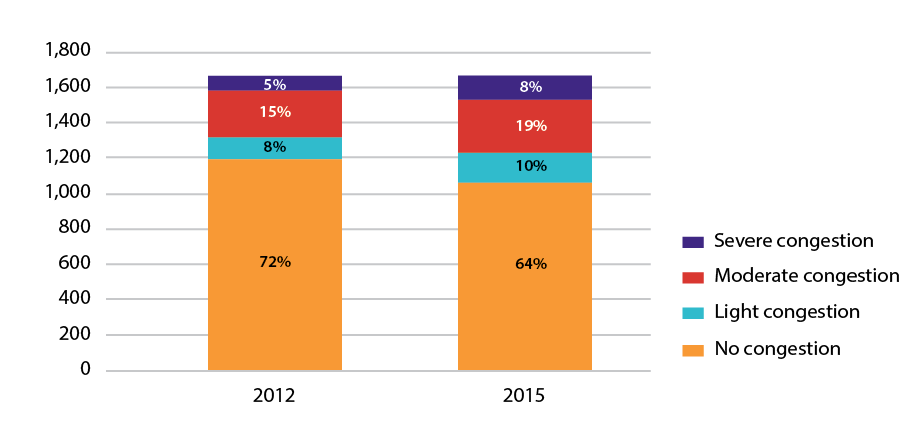
Note: This chart displays data for the 97 municipalities in the Boston Region MPO area. The AM peak-period time window for expressways is: 6:00 AM to 10:00 AM.
CMP = congestion management process.
Source: Boston Region MPO Congestion Management Process, 2012 and 2015 INRIX data.
Figure 6-3
Lane Miles of Congestion on CMP Monitored Expressways in the PM Peak Period,
2012 and 2015 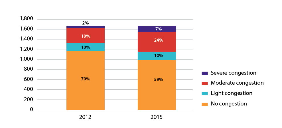
Note: This chart displays data for the 97 municipalities in the Boston Region MPO area. The PM peak-period time window for expressways is 3:00 PM to 7:00 PM.
CMP = congestion management process.
Source: Boston Region MPO Congestion Management Process, 2012 and 2015 INRIX data.
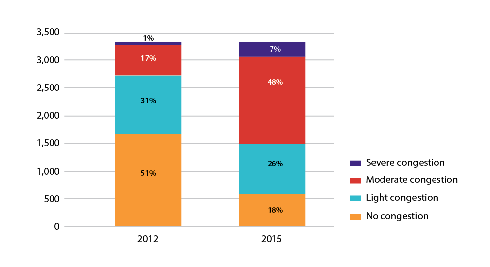
Figures 6-2 and 6-3 show that congestion is getting worse on the region’s expressways. While 28 percent of CMP-monitored express highways experienced some congestion during the AM peak period in 2012, this share increased to 37 percent in 2015. The number of lane miles experiencing moderate congestion increased by 53 lane-miles (21 percent) between these two time periods, while the number of lane miles experiencing severe congestion increased by approximately 47 lane miles (60 percent). During the PM peak-period, 30 percent of monitored expressways experienced some level of congestion in 2012 and by 2015, this increased to 41 percent. The number of lane miles experiencing moderate congestion increased by 97 lane miles (33 percent), while the number of lane miles experiencing severe congestion increased by 83 lane miles (258 percent).
Figure 6-4
Lane Miles of Congestion on CMP Monitored Arterial Roadways in the AM Peak Period, 2012 and 2015
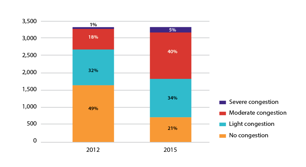
Note: This chart displays data for the 97 municipalities in the Boston Region MPO area. The AM peak-period time window for arterial roadways is 6:30 AM to 9:30 AM.
CMP = congestion management process.
Source: Boston Region MPO Congestion Management Process, 2012 and 2015 INRIX data.
Figure 6-5
Lane Miles of Congestion on CMP Monitored Arterial Roadways in the PM Peak Period, 2012 and 2015
Note: This chart displays data for the 97 municipalities in the Boston Region MPO area. The PM peak-period time window for arterial roadways is 3:30 PM to 6:30 PM.
CMP = congestion management process.
Source: Boston Region MPO Congestion Management Process, 2012 and 2015 INRIX data.
Figures 6-4 and 6-5 show that congestion was worse on arterial roadways than on expressways, even in 2012, and that congestion has also gotten worse based on 2015 data. In the AM peak period, 51 percent of arterial roadways experienced congestion of some kind in 2012—this increased to 79 percent in 2015. The number of lane miles experiencing moderate congestion increased by approximately 742 lane miles (124 percent) between these two time periods, while the number of lane miles experiencing severe congestion increased by approximately 117 lane miles (287 percent). During the PM peak period, 49 percent of monitored expressways experienced some level of congestion in 2012—by 2015, this increased to 81 percent. The number of lane miles experiencing moderate congestion increased to 1,016 lane miles (179 percent), while the number of lane miles experiencing severe congestion increased by 224 lane miles (more than 1000 percent).
The increase in congestion in the MPO region could have numerous causes, among them the growing economy and population, the popularity of TNCs, displacement of workers to outer suburbs in search of affordable housing, and the customer-facing cost of driving being low—relative to the cost of using public transit. More work will be needed during the duration of Destination 2040 to fully understand the causes and consequences of this congestion.
The MPO has identified a priority set of congested locations on the region’s express highways and arterials. These locations are shown in Table 6-4 and Figure 6-6, respectively. To identify the bottleneck locations, three measures were selected from various datasets for segments of the region’s road network. The measures include:
The information used to establish traffic bottlenecks is more advanced than what was used for the previous LRTP, Charting Progress to 2040. As a consequence of this improved data, the priority locations listed in Table 6-4 and Figure 6-6 focus more closely on the specific locations causing or exacerbating regional congestion. This new approach is illustrated in Table 6-4 with a column that shows how each congested location identified now compares to the assessment of the same location in the previous LRTP. Many locations are shown as shorter segments now, focusing on perhaps one or two especially problematic intersections and nearby roadways. Other problem locations are the same as before, larger, or in some cases, newly identified as priority locations. The MPO uses the data developed here to select locations for study through the UPWP, as well as to develop regional priorities for funding through the TIP. MPO activities and investments that increase the reliability of the roadway network benefit both light and heavy vehicles such as trucks and buses.
Table 6-4
Priority Bottleneck Locations
| Municipality |
Routes |
Expressway Feature |
Comparison with Previous LRTP |
Number of HSIP Clusters |
EPDO |
Recent Study |
|---|---|---|---|---|---|---|
Malden |
US 1 |
Quarry bypass |
shorter |
2 |
325 |
MassDOT Project # 605012 - Route 1 Reconstruction and Widening: Preliminary Design |
Boston |
1A |
Boardman Street flyover |
new |
na |
na |
none |
Peabody |
128 |
Exit 26 |
same |
3 |
185 |
none |
Woburn |
I-93/I-95 |
Interchange |
shorter |
7 |
1,292 |
none |
Everett |
99-CUFC |
|
shorter |
3 |
181 |
2016: RSA: Broadway between Dexter Street and Beacham Street 2016: RSA: Santilli Circle and Sweetser Circle |
Medford |
60 |
|
longer |
4 |
290 |
2018: CTPS: Priority Roadways - Medford Square |
Burlington |
3A |
|
new |
2 |
122 |
none |
Wilmington |
38/129 |
|
shorter |
3 |
183 |
2012: CTPS: Safety and Operations Analysis at Selected Intersections: Main Street at Church Street and Burlington Avenue |
Somerville |
I-93 |
Embankment |
shorter |
4 |
633 |
none |
Cambridge |
2A/16 |
|
shorter |
4 |
212 |
2009: CTPS: Alewife Studies, Phases One and Two |
Arlington |
2A/16 |
|
new |
na |
na |
2009: CTPS: Alewife Studies, Phases One and Two |
Arlington |
60 |
|
longer |
2 |
126 |
none |
Bolton |
117 |
|
new |
3 |
145 |
2011: CTPS: Safety and Operations Analyses at Selected Boston Region MPO Intersections: Main Street (Route 117) at Still River Road (Route 110) |
Newton |
I-90 |
Exits 16–17 |
same |
5 |
395 |
2006: CTPS: I-90 Interchange 17 (Newton Corner): Traffic Patterns and Operational and Safety Improvements
2009: CTPS: Newton Corner Rotary Study: Phase Two |
Weston |
I-90 |
Exits 13–14 |
new |
4 |
485 |
2011: CTPS: Low-Cost Improvements to Express-Highway Bottleneck Locations: I-95 northbound, ramp merge area at interchange 24 in Weston
2015: CTPS: Low-Cost Improvements to Express-Highway Bottleneck Locations: I-95 southbound at the I-90 Interchange in Weston |
Natick |
I-90 |
Exits 13–14 |
new |
2 |
97 |
none |
Weston |
US 20 |
|
same |
3 |
211 |
2011: CTPS: Weston Community Transportation Technical Assistance: Boston Post Road, Church Street, and School Street Intersection |
Wellesley |
16/9 |
|
shorter |
6 |
350 |
none |
Sherborn |
16/27 |
|
shorter |
na |
na |
none |
Holliston |
16/126 |
|
shorter |
2 |
107 |
2012: RSA: Washington Street |
Canton |
I-93/I-95 |
Interchange |
new |
5 |
356 |
2013: I-95 Northbound Off-Ramp to I-93 Northbound—Construction Completed
2015: Canton Street/University Avenue Intersection—Construction Completed
2016: University Avenue Off Ramp—Construction Completed
2016: Dedham Street—Ongoing On-Hold (I-95/I-93 Interchange: 25% Design) |
Boston |
DCR |
|
new |
3 |
244 |
none |
Canton |
138 |
|
shorter |
4 |
354 |
2016: RSA: Route 138 at Randolph Street
2017: CTPS: Route 138 Priority Corridor Study |
Westwood |
US 1 |
|
same |
1 |
62 |
none |
Norwood |
US 1 |
|
same |
3 |
176 |
2014: RSA: Neponset Street Rotary/Pendergast Rotary
2017: RSA: Providence Highway (Route 1) at Morse Street
2014: Route 1 at Everett Street and University Avenue |
Walpole |
US 1 |
|
same |
4 |
234 |
2017: Providence Highway (Route 1) at Coney Street 2013 - Providence Highway (Route 1) at High Plain Street (Route 27) |
Medfield |
109/27 |
|
new |
na |
na |
2008: CTPS: Safety and Operations Analysis at Selected Intersections: Route 109 at Route 27 |
Boston |
I-93 |
Southeast Expressway |
same |
9 |
2,267 |
2012: CTPS: Improving the Southeast Expressway—A Conceptual Plan |
Milton |
I-93 |
Southeast Expressway |
same |
3 |
745 |
2012: CTPS: Improving the Southeast Expressway—A Conceptual Plan |
Quincy |
I-93 |
Southeast Expressway |
same |
4 |
1,062 |
2012: CTPS: Improving the Southeast Expressway—A Conceptual Plan
2006: CTPS: I-93/Southeast Expressway/Route 3 (Braintree Split)—Operational Assessment and Potential Improvements |
Braintree |
I-93 |
Southeast Expressway approach |
new |
4 |
734 |
2006: CTPS: I-93/Southeast Expressway/Route 3 (Braintree Split)—Operational Assessment and Potential Improvements |
Randolph |
I-93 |
Southeast Expressway approach |
new |
4 |
265 |
2006: CTPS: I-93/Southeast Expressway/Route 3 (Braintree Split)—Operational Assessment and Potential Improvements |
Braintree |
3 |
Southeast Expressway approach |
new |
4 |
386 |
2006: CTPS: I-93/Southeast Expressway/Route 3 (Braintree Split)—Operational Assessment and Potential Improvements |
Weymouth |
3 |
Southeast Expressway approach |
new |
2 |
138 |
2016: RSA: Route 3 |
Quincy |
3A |
|
same |
10 |
778 |
2012: CTPS: FFY 2012 Safety and Operations Analyses at Selected Boston Region MPO Intersections: Southern Artery (Route 3A) at Sea Street/Coddington Street and at McGrath Highway/Field Street |
Weymouth |
3A |
|
same |
1 |
85 |
2016: RSA: Route 3A from Evans Street to Abigail Adams State Park |
Hingham |
3A |
|
shorter |
na |
na |
2016: CTPS: Summer Street/George Washington Boulevard Subregional Priority Roadway Study in Hingham and Hull |
Weymouth |
18 |
|
same |
9 |
884 |
2011: RSA: Route 18 at Various Locations |
Braintree |
37-CUFC |
|
new |
5 |
425 |
2014: CTPS: Safety and Operations Analyses at Selected Intersections: FFY 2013: Franklin Street (Route 37) at West Street and Granite Street |
Note: The Central Transportation Planning Staff (CTPS) is the staff to the Boston Region MPO. In addition to its work with the Boston Region MPO, CTPS works with and conducts studies for other transportation agencies in the state.
CTPS = Central Transportation Planning Staff. CUFC = Critical Urban Freight Corridor. DCR = Department of Conservation and Recreation. EPDO = Equivalent Property Damage Only. HSIP = Highway Safety Improvement Program. MassDOT = Massachusetts Department of Transportation. na = none available. RSA = roadway safety audit.
Source: Boston Region MPO.
Figure 6-6
Priority Bottleneck Locations
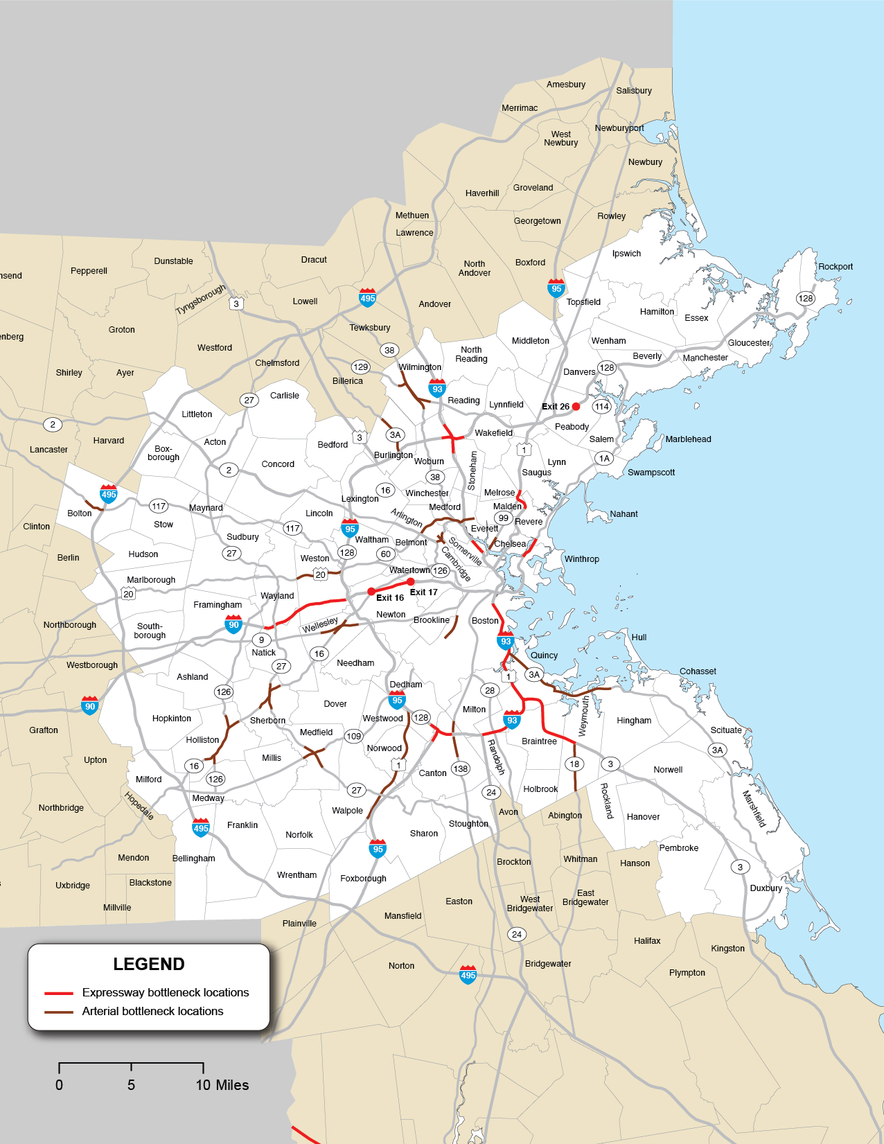
Source: Boston Region MPO.
In addition to the performance measures tracked as part of the MPO’s CMP, described in the “Changes in Traffic Congestion” section above, the MPO is required to establish specific performance targets for federally required performance measures for travel reliability on the National Highway System (NHS) in the Boston region. These measures include
These target measures capture whether travel times on an NHS segment are consistent (reliability), and the extent to which NHS users’ travel may be affected by those conditions (percent of person-miles). Information on the development of these targets is described in more detail in the Destination 2040 LRTP chapter on performance.
Both states and MPOs are required to set two-year and four-year targets for these measures. In 2018, the Massachusetts Department of Transportation (MassDOT) calculated baselines and established targets for these measures for the Massachusetts Interstate and non-Interstate NHS networks. Table 6-5 shows MassDOT’s calendar year (CY) 2017 baselines and two-year and four-year targets for these measures. The Boston Region MPO (like all MPOs) was also required to establish four-year targets for these measures by either supporting state targets or setting its own quantitative targets for the MPO region. In 2018, the MPO voted to support the state’s four-year targets. Table 6-5 also shows CY 2017 baselines for the Boston region’s Interstate and non-Interstate NHS networks as a basis for comparison. As the table shows, Boston’s share of reliable person-miles traveled on its Interstate and non-Interstate NHS networks is lower than those values for Massachusetts as a whole.
Table 6-5
Travel Time Reliability Performance Measure Baselines and MassDOT Performance Targets
Network |
Measure |
Cumulative Traffic |
2017 Measure |
Two-Year Target |
Four-Year Target |
Massachusetts—Interstate Highway System |
Percent of person-miles on the Interstate Highway System that are reliable |
1,150 |
68.0% |
68.0% |
68.0% |
Massachusetts—Non-Interstate NHS System |
Percent of person-miles on the non-Interstate NHS that are reliable |
5,257 |
80.0% |
80.0% |
80.0% |
Boston Region—Interstate Highway System |
Percent of person-miles on the Interstate Highway System that are reliable |
354 |
47.2% |
na |
See Massachusetts Target |
Boston Region—Non-Interstate NHS System |
Percent of person-miles on the non-Interstate NHS that are reliable |
1,799 |
69.0% |
na |
See Massachusetts Target |
aThe two-year target reflects conditions as of the end of CY 2019, and the four-year target reflects conditions as of the end of CY 2021.
CY = calendar year. MassDOT = Massachusetts Department of Transportation. NHS = National Highway System. na = not applicable
Sources: National Performance Management Research Data Set, Cambridge Systematics, MassDOT, and the Boston Region MPO.
MassDOT and the Boston Region MPO also monitor traffic congestion to meet Congestion Mitigation and Air Quality Improvement (CMAQ) program requirements. The performance measures employed are designed to help states, the Federal Highway Administration (FHWA), and MPOs better understand the impacts of CMAQ investments, which are intended to contribute to air quality improvements and provide congestion relief.
CMAQ traffic congestion-related performance measures apply to urbanized areas that contain geographic locations designated as nonattainment areas or maintenance areas by the United States Environmental Protection Agency (EPA). A nonattainment area does not meet National Ambient Air Quality Standards (NAAQS) for monitored air pollutants; a maintenance area is one with a history of nonattainment that now meets the standards and where air quality continues to be monitored. The EPA monitors common air pollutants, known as criteria pollutants, including carbon monoxide, nitrogen dioxide, ozone, particulate matter, sulfur dioxide, and precursors from mobile sources.3
States must be involved in setting targets for these measures if 1) they have mainline highways on the NHS that cross part of an urbanized area (UZA) with a population of more than one million; and 2) that UZA contains part of a nonattainment or maintenance area for relevant criteria pollutants. Similarly, MPOs must participate in target setting for the traffic congestion measures if they
Massachusetts and the Boston Region MPO each meet these respective criteria and must be involved in monitoring and setting targets for traffic congestion performance measures for the Boston UZA, which contains or overlaps several MPO areas in eastern Massachusetts, New Hampshire, and Rhode Island.
The first of these CMAQ traffic congestion measures is annual hours of peak hour excessive delay (PHED) per capita, which estimates the excessive delays experienced by a UZA’s population from travel on the NHS during peak-periods. Information on the development of PHED per capita targets is described in more detail in the Destination 2040 LRTP chapter on performance.
To understand baseline performance and set targets for this measure, MassDOT and the New Hampshire Department of Transportation (NH DOT) worked with analysts at Cambridge Systematics. Using 2017 data, MassDOT and NH DOT calculated annual hours of PHED for travel on the NHS in their respective portions of the Boston UZA.4 In 2018, the agencies in the Boston UZA that are subject to CMAQ performance monitoring requirements—MassDOT, NH DOT, the Boston Region MPO, and the Northern Middlesex Council of Governments (NMCOG)—established two-year and four-year targets that maintain this 2017 baseline value for the annual hours of PHED per capita measure, as shown in Table 6-6.
Table 6-6
Baseline Value and Performance Targets for Annual Hours of Peak Hour Excessive Delay Per Capita for the Boston UZA
Geographic Area |
Massachusetts and New |
Boston UZA Population (MA and NH only)a |
2017 Measure Value (Baseline) |
Two-Year Target |
Four-Year Target |
Boston Urbanized Area |
80,053,183 |
4,371,476 |
18.30 |
18.30 |
18.30 |
a Cambridge Systematics aggregated 2012–16 American Community Survey population estimates at the block group level to estimate the population for the portion of the UZA in Massachusetts and New Hampshire. Cambridge Systematics then inflated this estimate for 2017 by applying information on expected population growth in the Boston Metropolitan Statistical area between 2016 and 2017.
CY =calendar year. MA = Massachusetts. NH = New Hampshire. PHED = peak hours of excessive delay. UZA = urbanized area.
Sources: National Performance Management Research Data Set, US Census, FHWA, MassDOT, the New Hampshire Department of Transportation, and Cambridge Systematics.
States and MPOs that meet applicability criteria for CMAQ performance requirements must also monitor and set targets for the share of non-single occupant vehicle (non-SOV) travel in the Boston region. Agencies calculate this measure at the UZA level. The percent of non-SOV travel performance measure describes the extent to which people are using alternatives to single-occupant vehicles (SOVs), as greater use of alternative SOVs may help reduce traffic congestion and air pollution from motor vehicles.
Collectively, MassDOT, NH DOT, the Boston Region MPO, and NMCOG used the US Census Bureau’s American Community Survey (ACS) data5 to estimate the percent of workers age 16 and older who commuted to work using an option other than driving alone.6 Figure 6-7 shows how the percentage of workers using non-SOV commuting options in the Boston UZA has increased between 2012 (2008–12 ACS estimate) and 2016 (2012–16 ACS estimate). MassDOT calculated a linear trend line using these values for the Boston UZA and used that trend line to project expected values as of the end of CY 2019 (the expected 2015–19 ACS estimate) and CY 2021 (the expected 2017–21 ACS estimate). These agencies established these projected values as the Boston UZA targets for the percent of non-SOV travel. Table 6-7 also lists the recent baseline and performance target for this measure.
Figure 6-7
Historic Values and Performance Targets for the Percent of
Non-SOV Travel in the Boston UZA 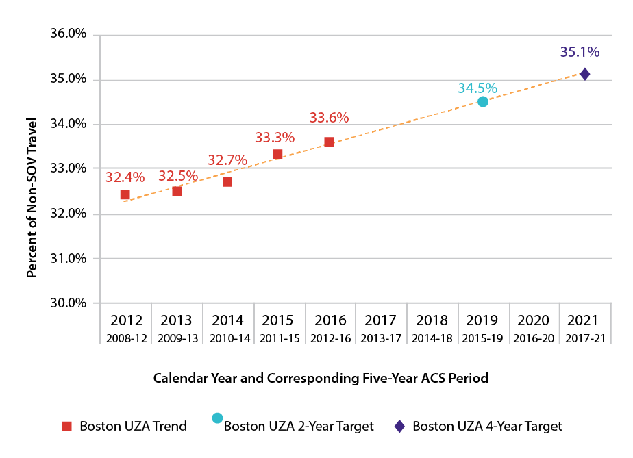
ACS = US American Community Survey. SOV = single-occupancy vehicle. UZA = urbanized area.
Sources: US Census Bureau, 2012–16 American Community Survey Five-Year Estimates; MassDOT; and NH DOT.
Table 6-7
Baseline Value and Performance Targets for Percent of
Non-SOV Travel for the Boston UZA
Geographic Area |
2017 Measure Value (Baseline) |
Two-Year Target |
Four-Year Target |
Boston UZA |
33.6% |
34.5% |
35.1% |
ACS = American Community Survey. CY = calendar year. SOV = single-occupancy vehicle. UZA = urbanized area.
Sources: MassDOT, NH DOT, and ACS.
The MPO and its staff will continue to monitor the implementation of CV and AV technology in the Boston region. It is commonly thought that the adoption of CV and AV technology will result in significant capacity gains on roadway networks, but the timeline for adoption of this technology and its feasibility, remains highly uncertain, as do the second-order effects of any such boosts in capacity. The MPO has initiated its planning efforts through the report Connected and Autonomous Vehicles and the Boston MPO—A First Look, presented in 2018. This report chronicles the development of CV and AV technology up to the point of its publishing and recommends a number of planning and policy actions that the MPO can take to maintain a flexible, proactive stance toward CV and AV development and implementation. MPO staff have since made progress on incorporating CV and AV planning into ongoing MPO programs, and staff continue to familiarize themselves on CV and AV issues, since CV and AV planning could potentially play a role in future scenario planning.
TheCommission on the Future of Transportation in the Commonwealth report, Choices for Stewardship: Recommendations to Meet the Transportation Future includes a recommendation to develop a strategy to support CVs and AVs. The MPO will coordinate with MassDOT to help implement this recommendation.
One of the biggest developments in the transportation planning world since the MPO’s last LRTP has been the rapid growth of shared-used and for-hire car services, more commonly known as ridesourcing, ridesharing, and ride-hailing, among other terms. TNCs, such as Uber and Lyft, are the highest profile segment of the shared-use transportation field. This is a rapidly evolving industry, and it has already had a significant impact on transportation, however, the impact on existing transportation networks and on the future of transportation still remains unclear. MPO staff has documented the region’s shared-use options through the March 2017 report, Shared-Use Mobility Options—Literature Review.7 In a demonstration of the volatility of the field, several of the companies that were featured in the report have since gone out of business in Boston.
Public research and policy concern has largely focused on the highest-profile subsector of the shared-use field—TNCs. The State of Massachusetts Department of Public Utilities has begun collecting data on ridesharing/ride-hailing trips. The data is presented in Tables 6-8 and 6-9.8 Table 6-8 shows the estimated person trips and ride-hailing activity for municipalities in the Inner Core area, where the vast majority of TNC trips in the region are taken. Boston and Cambridge have the largest number of trips and ridesharing activity with Somerville and Brookline following closely behind.
Table 6-8
Estimated Person Trips and Ride-Hailing Activity for Inner Core Subregion Municipalities
Municipality |
Trips Started Per Person |
Annual Trips |
Annual Trips |
Ride-hailing Trips |
Ride-hailing Trips |
Boston |
57 |
967,288,818 |
895,499,530 |
34,911,476 |
35,221,885 |
Cambridge |
64 |
189,847,847 |
179,109,006 |
6,782,366 |
6,454,440 |
Somerville |
36 |
87,268,870 |
88,633,826 |
2,727,951 |
2,637,115 |
Brookline |
35 |
70,797,608 |
76,026,259 |
2,074,425 |
1,963,570 |
Chelsea |
19 |
43,285,073 |
42,986,266 |
656,686 |
632,627 |
Medford |
17 |
66,409,699 |
67,903,947 |
966,710 |
966,364 |
Malden |
15 |
62,232,358 |
64,944,230 |
906,043 |
867,169 |
Revere |
14 |
54,481,061 |
57,125,847 |
722,136 |
714,901 |
Everett |
19 |
61,619,596 |
56,293,077 |
775,773 |
753,268 |
Watertown |
15 |
47,959,601 |
46,679,180 |
469,122 |
480,161 |
Newton |
12 |
122,452,446 |
125,034,672 |
1,051,030 |
1,073,900 |
Quincy |
10 |
118,837,779 |
116,245,809 |
957,311 |
963,069 |
Waltham |
12 |
102,810,459 |
94,488,201 |
711,420 |
723,227 |
Belmont |
8 |
29,546,032 |
30,494,233 |
195,807 |
201,636 |
Winthrop |
6 |
16,736,781 |
17,819,225 |
103,750 |
103,862 |
Arlington |
6 |
47,519,338 |
50,888,290 |
258,133 |
273,416 |
Lynn |
6 |
106,210,599 |
104,907,612 |
549,822 |
511,532 |
Milton |
5 |
29,705,413 |
33,198,745 |
138,761 |
142,492 |
Melrose |
5 |
30,007,776 |
31,644,455 |
129,355 |
143,475 |
Saugus |
6 |
40,654,204 |
39,434,253 |
147,714 |
162,887 |
Source: Data in this table courtesy of the Metropolitan Area Planning Council, originally published in Share of Choices report.
The Metropolitan Area Planning Council (MAPC) has also published two reports on the topic of ride-hailing: Fare Choices9 (February 2018) and Share of Choices10 (May 2018). The Fare Choices study collected data on trip origins and destinations, demographics, and transportation options through an in-vehicle survey of ride-hailing users, finding that ride-hailing users skew young (two-thirds of survey respondents were between 22 and 34 years old) but resemble the region at large in terms of income. Similar to the CTPS literature review,11 the Fare Choice report also raised questions about whether ride-hailing trips are replacing trips made by more sustainable modes, and if that is diverting financial resources from providers such as the Massachusetts Bay Transportation Authority (MBTA). The Share of Choices report used newly collected state-level data and modeling to estimate that one ride-hailing trip is taken for every five transit trips in the Inner Core, as shown in Table 6-9. It also notes that this dynamic may have cost the MBTA upwards of $19.3 million in 2017.
Table 6-9
Estimated Mode Shares of Ride-Hailing Activity and Public Transit for Inner Core Subregion Municipalities
Municipality |
Ride-hailing |
Public transit |
Ratio |
Ride-hailing |
Public transit |
Ratio |
Somerville |
3.13% |
8.27% |
0.38 |
2.98% |
8.18% |
0.36 |
Everett |
1.26% |
3.47% |
0.36 |
1.34% |
3.81% |
0.35 |
Cambridge |
3.57% |
12.65% |
0.28 |
3.60% |
13.31% |
0.27 |
Chelsea |
1.52% |
5.98% |
0.25 |
1.47% |
5.95% |
0.25 |
Medford |
1.46% |
5.80% |
0.25 |
1.42% |
5.66% |
0.25 |
Brookline |
2.93% |
13.06% |
0.22 |
2.58% |
12.21% |
0.21 |
Malden |
1.46% |
6.59% |
0.22 |
1.34% |
6.31% |
0.21 |
Boston |
3.61% |
18.19% |
0.20 |
3.93% |
19.54% |
0.20 |
Winthrop |
0.62% |
3.47% |
0.18 |
0.58% |
3.24% |
0.18 |
Arlington |
0.54% |
3.12% |
0.17 |
0.54% |
3.01% |
0.18 |
Watertown |
0.98% |
5.65% |
0.17 |
1.03% |
5.82% |
0.18 |
Waltham |
0.69% |
4.24% |
0.16 |
0.77% |
4.60% |
0.17 |
Melrose |
0.43% |
2.68% |
0.16 |
0.45% |
2.56% |
0.18 |
Revere |
1.33% |
8.80% |
0.15 |
1.25% |
8.44% |
0.15 |
Quincy |
0.81% |
5.57% |
0.14 |
0.83% |
5.68% |
0.15 |
Newton |
0.86% |
6.41% |
0.13 |
0.86% |
6.29% |
0.14 |
Belmont |
0.66% |
5.17% |
0.13 |
0.66% |
5.00% |
0.13 |
Milton |
0.47% |
3.80% |
0.12 |
0.43% |
3.44% |
0.12 |
Saugus |
0.36% |
3.45% |
0.11 |
0.41% |
3.61% |
0.11 |
Lynn |
0.52% |
7.66% |
0.07 |
0.49% |
7.77% |
0.06 |
Inner Core |
2.41% |
11.78% |
0.20 |
2.48% |
12.14% |
0.20 |
Source: Table courtesy of the Metropolitan Area Planning Council, originally published in Share of Choices report.
The growth in the field raises serious questions of how MPO and broader public policy should relate to shared-use services. While bike-sharing likely complements the MPO’s goals of promoting growth in demand for nonautomotive travel options and mode shift, the effect of TNCs, car sharing and the like, is less certain.
As the MPO literature review documents state, there are serious equity-based concerns about access for people without bank accounts and/or smartphones; and disparities in service availability and accessibility for individuals with disabilities. Ride-hailing may also divert financial resources from public sector transportation providers and contribute to congestion on the region’s roadways. MAPC’s Fare Choices report estimated that “15 percent of all ride-hailing trips replaced a more sustainable mode during the morning and afternoon commutes.” Although experiments are ongoing around the country, such services remain largely unintegrated with other modes of transit.
Car sharing provides an alternative to both ride-hailing and traditional car ownership—users rent cars by the hour from a provider, but with more flexibility and automation than a traditional car rental business. Cars are physically located throughout communities rather than concentrated at a company facility. The dominant car sharing company in the Boston region is Zipcar. General Motors’ Maven also has a small presence in the Inner Core, while Enterprise Car Share wound down its Boston-area operations in 2017. Like ride-hailing, the impact of car sharing and its role in future policy is an open question subject to further study. Table 6-10 provides information on the accessibility of jobs and housing to car sharing in the Inner Core of the MPO region (where the majority of car sharing locations are found) while Figure 6-8 shows the locations overlaid by population density. Although there are not as many car sharing locations, there are locations outside of the Inner Core in municipalities including Beverly, Framingham, Lynn, Salem, Wellesley, and Wenham.
Table 6-10
Access to Car Sharing in the Boston Region
Car Share |
Employment |
Percent of Employment |
Households |
Percent of Households |
Population |
Percent of Population |
Inner Core |
1,006,000 |
|
616,800 |
|
1,487,900 |
|
Within 1/4 mile |
665,900 |
66% |
287,300 |
47% |
676,300 |
45% |
Within 1/2 mile |
814,200 |
81% |
422,300 |
68% |
1,011,000 |
68% |
Regional Urban Centers |
307,700 |
|
234,200 |
|
566,200 |
|
Within 1/4 mile |
19,900 |
6% |
10,300 |
4% |
23,200 |
4% |
Within 1/2 mile |
42,000 |
14% |
30,200 |
13% |
69,500 |
12% |
Maturing Suburbs |
470,200 |
|
339,800 |
|
871,900 |
|
Within 1/4 mile |
1,700 |
< 1% |
800 |
< 1% |
3,400 |
< 1% |
Within 1/2 mile |
5,800 |
1% |
4,000 |
1% |
12,700 |
1% |
Developing Suburbs |
139,700 |
|
121,200 |
|
319,900 |
|
Within 1/4 mile |
90 |
< 1% |
20 |
< 1% |
240 |
< 1% |
Within 1/2 mile |
310 |
< 1% |
90 |
< 1% |
900 |
< 1% |
Note: Data includes car shares operated by ZipCar and Maven.
MPO = metropolitan planning organization.
Source: Boston Region MPO.
CTPS and MAPC have made progress toward quantifying the impact of ride-hailing on the Boston Region MPO’s transportation network, but significant work remains to be done both in research and in shaping policy to respond to the emergence of TNCs, car sharing, and other shared-use modes. This will be an issue that the MPO will continue to discuss during the development ofthe Destination 2040 LRTP, as new information becomes available.
Figure 6-8
Car Sharing Locations in the Inner Core of the Boston Region
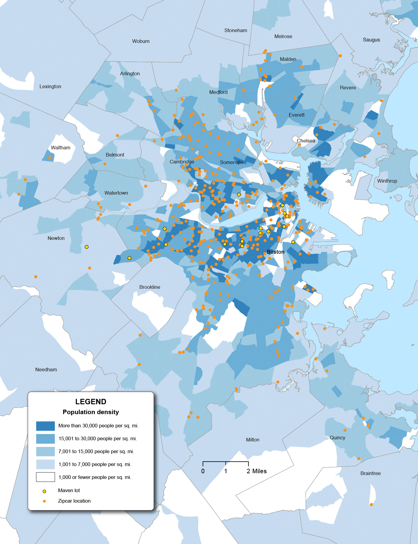
Source: Boston Region MPO.
In addition to analyzing current roadway capacity and potential for growth, some planning entities engage in policies and activities intended to decrease overall demand for roadway usage, especially by single-occupancy vehicles. These programs often fall under the broad title, “Travel Demand Management,” or TDM. Several MPO member municipalities, including Cambridge, Watertown, and Arlington, have established TDM programs in one form or another. MAPC maintains a resource library on TDM at https://www.mapc.org/resource-library/parking-and-transportation-demand-management/.
The MPO region is home to a number of Transportation Management Associations, or TMAs, which are membership-based, often public-private partnerships of businesses, institutions, and municipalities. TMAs often operate their own shuttle services that supplement available transit service. A list of TMA-operated shuttle services in Massachusetts is available at http://www.masscommute.com/tma_directory/.
One important element of TDM programs is appropriate management of parking supply. Research incorporating data from MPO member municipalities, Cambridge and Somerville, has proposed a causal link between increased provision of parking and increased car travel,12 while other research has estimated that drivers looking for parking comprise up to 30 percent of traffic in urban Central Business Districts.13 MAPC’s Perfect Fit Parking report has surmised that indeed, some demand for parking may be induced by the provision of parking, that is, that additional parking (and therefore additional travel and stress on the roadway network) is added by inefficient management of parking policy.14 MAPC offers MPO member municipalities assistance with parking management and policy through its Parking Management Planning program, while CTPS offers traffic impact analysis through its Community Transportation Technical Assistance program. Given the growing congestion and stress on the regional roadway network, both agencies can continue to research and plan for parking management methods to reduce overall roadway travel demand.
Another potential new frontier for managing roadway demand is the possibility of pricing roadway usage. In the MPO region, the only tolled roadway is Interstate 90, also known as the Massachusetts Turnpike. Over the last several years, there has been increasing legislative interest in the possibility of using road pricing to manage the region’s growing congestion. The MPO’s UPWP committee discussed the possibility of a study on congestion pricing during the development process of the federal fiscal year (FFY) 2020 UPWP. Ultimately, the MPO decided not to fund the study, but plan to consider it again for the FFY 2021 UPWP. While the future of road pricing initiatives in the MPO region is unclear, the MPO and staff should continue to monitor developments and could potentially study the impacts of various paradigms for road pricing.15
During fall 2017 and winter 2018, MPO staff collected feedback on transportation issues, needs, and opportunities from municipal planners and officials, transportation advocates, members of the general public, and other stakeholders. The following sections focus on roadway capacity management and mobility issues by theme.
Respondents have noticed an increased demand for dense urban living and auto-free lifestyles. The latter has been further enabled by increased ride-hailing options. They predicted continued interest in more “European” streets with sidewalk cafes and biking/pedestrian-only zones. One respondent felt that people should not expect to be able to park in downtowns. Others predicted an increase in “battles” over roadway space with increases in online deliveries, ride-hailing services, and demand for protected cycling infrastructure and dedicated bus lanes.
Generally, respondents expressed a desire for access to alternative modes of transportation to mitigate the impacts of congestion. Respondents wanted people to have the freedom to choose walking and biking and the infrastructure to encourage more to do so. In addition, respondents identified the need for more transportation options in the suburbs and for planners and policymakers to work with communities and regions to create first-and-last-mile connections. Many of the suggestions specific to transit and bicycling/walking are covered in the sections, below. Other proposed solutions included
The MPO and transportation policy-setting entities face a major challenge in regards to managing capacity and mobility on the region’s roadway network. Congestion is increasing along with the region’s population and economic activity, and the ability to add lane miles to the region’s roadway network is limited.
The increasing congestion affects not only drivers but many surface transit riders as well, and policymakers face pressure to deal with it while also accommodating diverse needs and modes. Indeed, from the perspective of managing capacity of people, modes other than the single-occupancy vehicle may be more spatially efficient. The introduction of new technologies and paradigms such as ride-hailing and car sharing pose fresh challenges and an uncertain future, and may make the congestion situation worse.
While models such as TDM programs have considerable room to grow and may help take some stress off of the roadway network, they are currently limited in scope and require considerable additional research. The MPO must monitor all of these considerations carefully, while assisting municipalities to understand the challenges now and in the future. Additional research will help the MPO to monitor the performance of the region’s roadway network in the future.
The ability to move freight and heavy vehicles more efficiently is critical to economic vitality for both the state and region. The dominant freight transportation mode in the Boston region is trucks. While freight also enters or leaves the region via airfreight, railroad, or ocean shipping, in almost all instances, goods traveling by these other modes must use trucks to connect with local origins and destinations. A number of specialized terminals, both publicly and privately owned, enable freight to transfer between different modes, and critically, within the region’s road network.
The MPO has a leading role in improving the region’s road network, but it also supports, and where possible facilitates improvements to other freight modes and associated terminals. The MPO collaborates with freight service providers and terminal operators, both public and private, throughout the region in its ongoing efforts to ensure region-wide freight and logistic efficiency.
The following section details freight-specific needs identified through MPO staff research and analysis. Specifically, those needs focused on
Trucks, both commercial and private, share the regional roadway network with light vehicles. Measuring, managing, and reducing delay in the region’s road network is an important and defined responsibility of the MPO and is the ongoing work of the MPO’s CMP. In conjunction with population and economic growth, freight movements are expected to increase steadily between now and 2040. Growth in heavy vehicle traffic will contribute to traffic congestion, but should not be considered the cause of congestion. The primary source of peak-period congestion will continue to be the large numbers of light vehicles generated by regional commuting and discretionary travel by households.
Strategies to affect mode shift in the MPO region are less applicable to freight, since no practical alternatives to trucks exist for final distribution of consumer goods to retail locations, as well as for most industrial logistic needs. Railroads have been successful in increasing intermodal shipments using high-capacity double-stacked rail services to modern terminals, such as the one in Worcester, but have also concentrated local freight delivery on a smaller number of high volume customers. Strategies, such as moving the CSX Intermodal yard to Worcester from Beacon Park in Allston, slow the growth of trucks on the national interstate system, but also add increasing numbers of trucks, and truck vehicle-miles of travel (VMT), to roadways within the Boston Region MPO. The impacts of larger shipping vessels using the expanded Conley Terminal rather than New York area terminals are similar; less statewide truck VMT but more MPO VMT.
The FHWA also requires states and MPOs to track truck travel reliability on the interstate system to better understand performance of the nation’s freight system. The applicable measure in this case is the Truck Travel Time Reliability (TTTR) Index. This measure compares longer (95th percentile) truck travel times to average (50th percentile) truck travel times—the greater the difference between these two travel times is on an interstate segment, the less reliable truck travel on that segment is considered to be. Information on the development of these targets is described in more detail in Chapter 5 of the Destination 2040 LRTP.
In 2018, MassDOT calculated baseline TTTR Index values and established performance targets using CY 2017 truck travel time data. As with the all-passenger travel time reliability targets, MassDOT set the two-year and four-year targets equal to the CY 2017 baseline. Table 6-11 displays these values. The MPO voted to support MassDOT’s four-year TTTR Index target in 2018, and Table 6-11 also includes the Boston region’s CY 2017 baseline index value. As the table shows, the Boston region’s TTTR baseline value is higher than the one for Massachusetts, indicating that truck travel on the region’s interstate network is generally less reliable than on Massachusetts’s interstates as a whole.
Table 6-11
Truck Travel Time Reliability Performance Measure Baselines and
MassDOT Performance Targets
Network |
Measure |
Cumulative Traffic |
2017 Measure |
Two-Year Target |
Four-Year Target |
Massachusetts—Interstate Highway System |
Truck Travel Time Reliability Index |
1,150 |
1.85 |
1.85 |
1.85 |
Boston Region—Interstate Highway System |
Truck Travel Time Reliability Index |
354 |
2.55 |
n/a |
See Massachusetts Target |
aThe two-year target reflects conditions as of the end of CY 2019, and the four-year target reflects conditions as of the end of CY 2021.
CY = calendar year. MassDOT = Massachusetts Department of Transportation. NHS = National Highway System.
Sources: National Performance Management Research Data Set, Cambridge Systematics, MassDOT, and the Boston Region MPO.
Routine questions about numbers of trucks and their percent of traffic usually go unanswered because total traffic volumes are obtained more frequently than the more complex process of classifying vehicle types in those volumes. Although MPO staff has assembled a set of reliable truck data, for truck model estimation purposes, it is not sufficient and detailed enough to use for infrastructure project selection. With the completion of an envisioned truck model estimation effort, working estimates of truck traffic throughout the region’s network will become available to support any regional planning effort.
The data that is available to staff suggests that the express highways which have been flagged as regional bottlenecks in the Roadway section of this chapter, are also sections of the road network with a large number of trucks. It is generally the case that the express highways will have a higher percentage of trucks than arterial streets in the region. However, the percent of trucks will vary from bottleneck to bottleneck. A safe assumption about addressing the needs of freight in 2040 is that improving the express highway bottlenecks as a group will likely be more beneficial than improving the arterial bottlenecks.
The analysis of truck traffic is further complicated by the fact that the temporal distributions of truck and light vehicle traffic are different. Trucks serving urban areas tend to start their day early, and often finish up their travel before the PM peak. However, this pattern of avoiding the evening rush hour is more pronounced for arterial traffic, and significant truck traffic on the express highways is experiencing both AM and PM congestion with light-vehicle commuters.
Consideration of the mobility needs of freight adds weight to the benefits of relieving congestion on the region’s limited-access express highways. Estimating the truck traffic flows impacted at individual bottlenecks on both express highways and arterials will require further refinement of the MPO’s truck modeling capabilities.
Most public input relevant to the movement of freight in the MPO region and to the MPO’s freight program is covered in the Roadway section above. However, specific freight-related comments are included below.
The growing congestion and delay in the region’s roadway network affects freight operators like it does drivers and surface transit riders. Additionally, freight operators making deliveries in the Inner Core area increasingly face competition for scarce curb space, as bus lanes, bike lanes, and TNC dropoffs demand their share as well. For the most part, concerns about freight congestion can be addressed through the MPO’s roadway actions, but policymakers should continue to consider the implications of freight transportation.
The MPO region is served by a variety of transit services. These services include:
Like the region’s roadway system, the region’s transit services and networks face reliability and capacity-management concerns. To date, most of the Boston Region MPO’s target funding for capital projects goes to support the roadway network, bicycle, and pedestrian facilities; with the region’s RTAs, the MassDOT Rail and Transit Division, and others supporting investment in the transit system. In the past, the MPO has flexed some of its highway funding to transit projects to support the construction of the Green Line Extension and Assembly Square Orange Line station.
In addition, the MPO has also made investments in the transit system through its Suburban Mobility Program, which evolved into the Clean Air and Mobility Program. The MPO currently has allocated CMAQ funds in the TIP for a new Community Transportation Program in FFYs 2021 through 2024, and conducted a study to determine the criteria for that program through the FFY 2018 UPWP. The Community Transportation Program is expected to fund and help plan fiscally sustainable mobility solutions with an emphasis on first-and-last-mile connections. The MPO also supports the distribution of federal transit grant funds by the Rail and Transit Division.
A number of different planning processes come together to address capacity management and mobility performance, issues, and needs on the transit system. The MPO performs ongoing system-level and project-level analyses for the LRTP and for transit service operations and capital improvements for MassDOT and the MBTA. The following sections describe transit-specific needs identified through MPO research and analysis.
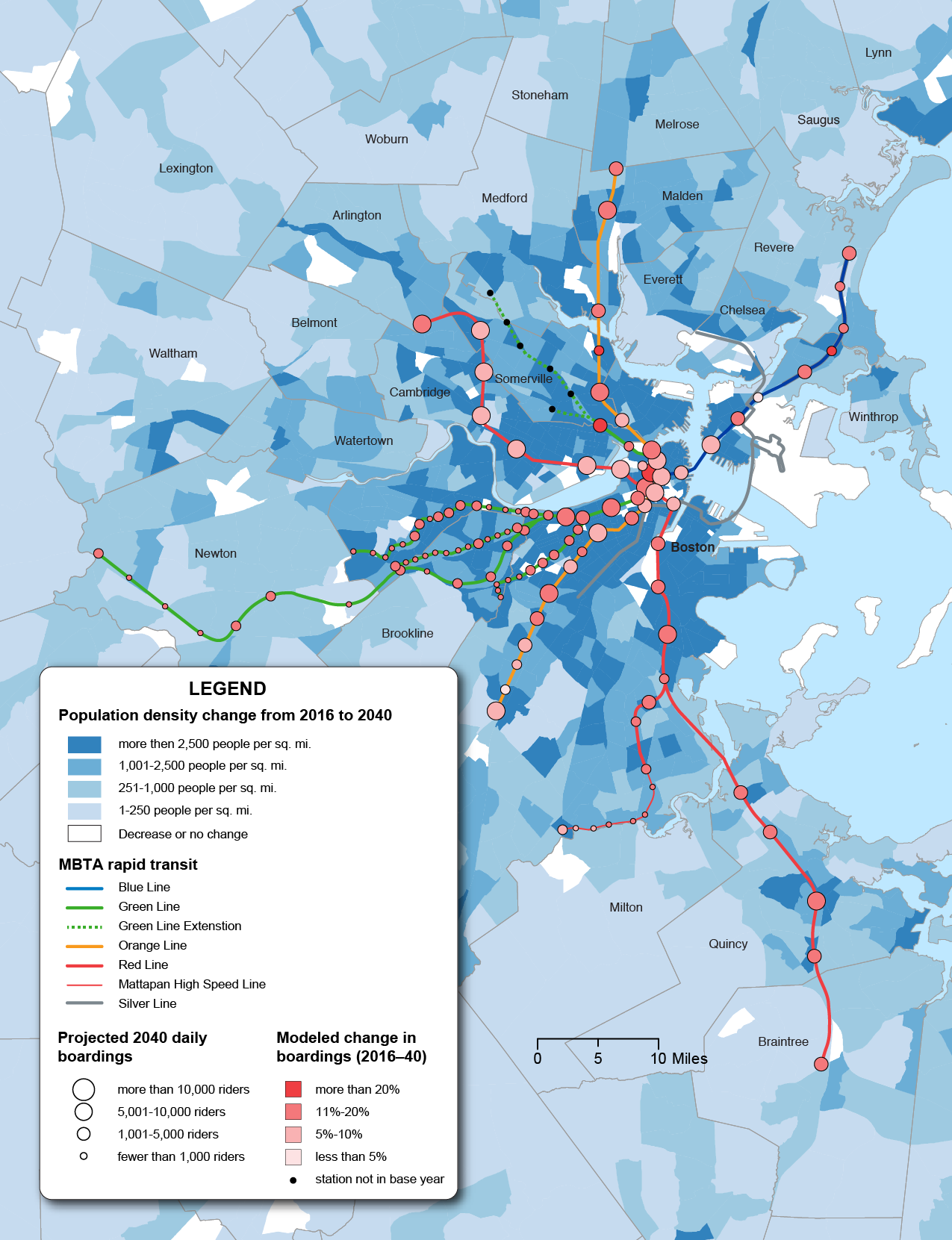
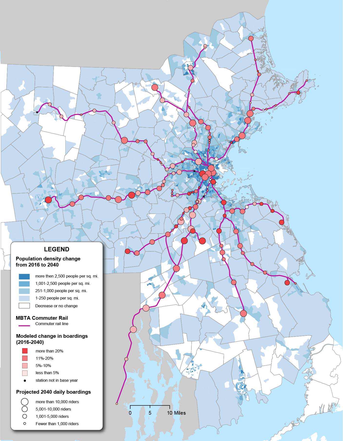
The following tables and figures show the current (2016) and projected (2040) daily boardings on the MBTA rapid transit and commuter rail networks, as projected by the MPO’s travel demand model—assuming no additional transit projects are constructed. This is also known as No-Build conditions. The figures also show the projected change in population density in relation to transit usage in the Boston region.
Table 6-12
Rapid Transit Boardings, 2016–40
Rapid Transit Lines |
2016 Daily Boardings |
Projected 2040 Daily Boardings |
Modeled Change in Daily Boardings |
Blue Line |
78,360 |
88,794 |
13% |
Green Line |
210,469 |
264,593 |
26% |
Green Line—Central Subway |
147,521 |
171,783 |
16% |
Green Line—B |
18,094 |
21,005 |
16% |
Green Line—C |
9,754 |
11,022 |
13% |
Green Line—D |
19,055 |
37,505 |
97% |
Green Line—E |
16,045 |
23,277 |
45% |
Orange Line |
223,605 |
247,641 |
11% |
Red Line |
298,272 |
333,601 |
12% |
Mattapan |
3,370 |
3,804 |
13% |
Silver Line |
33,340 |
63,866 |
92% |
Total |
847,416 |
1,002,298 |
18% |
Source: Boston Region MPO.
Table 6-13
Commuter Rail Boardings, 2016–40
Commuter Rail Lines |
2016 Daily Boardings |
Projected 2040 Daily Boardings |
Modeled Change in Daily Boardings |
Fairmount |
2,652 |
3,030 |
14% |
Fitchburg |
9,302 |
10,535 |
13% |
Franklin |
11,671 |
13,673 |
17% |
Greenbush |
6,109 |
7,163 |
17% |
Haverhill |
7,112 |
7,910 |
11% |
Kingston/Plymouth |
6,095 |
7,283 |
19% |
Lowell |
10,925 |
11,971 |
10% |
Middleborough/Lakeville |
6,863 |
8,118 |
18% |
Needham |
6,672 |
7,705 |
15% |
Providence/Stoughton |
25,728 |
28,956 |
13% |
Newburyport/Rockport |
15,019 |
16,944 |
13% |
Worcester |
18,636 |
22,852 |
23% |
Total |
126,784 |
146,139 |
15% |
Source: Boston Region MPO.
Figure 6-9
Rapid Transit Boardings, 2016–40
Source: Boston Region MPO .
Figure 6-10
Commuter Rail Boardings, 2016–2040
Source: Boston Region MPO.
Rail rapid transit is expected to see about 18 percent more boardings while commuter rail ridership is projected to increase about 15 percent. The increase in boardings on the Silver Line Bus rapid transit serving the growing Seaport District is due to the recently added SL3 route (added after 2016) that has key sections in dedicated right-of-ways. The increase on the Green Line D and E branches are due to the extension of the Green Line to College Avenue in Medford and Union Square in Somerville.
One important element to improving the regional transportation system is the accessibility of transit to housing, employment, and other key destinations. Access to safe, reliable, frequent transit gives travelers options other than single-occupancy vehicles; but the provision of such service alone is insufficient. High-quality transit must be supported by appropriate land use around its stops. The following figures should thus be understood as describing a situation that can be shaped by future MPO and other public policy.
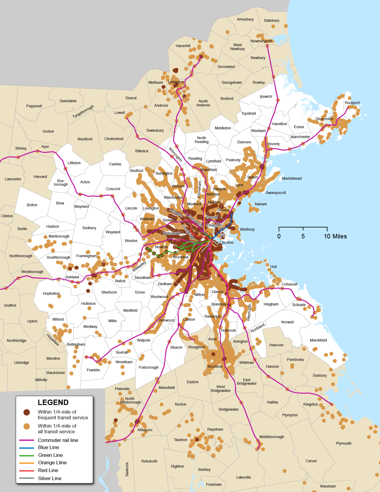
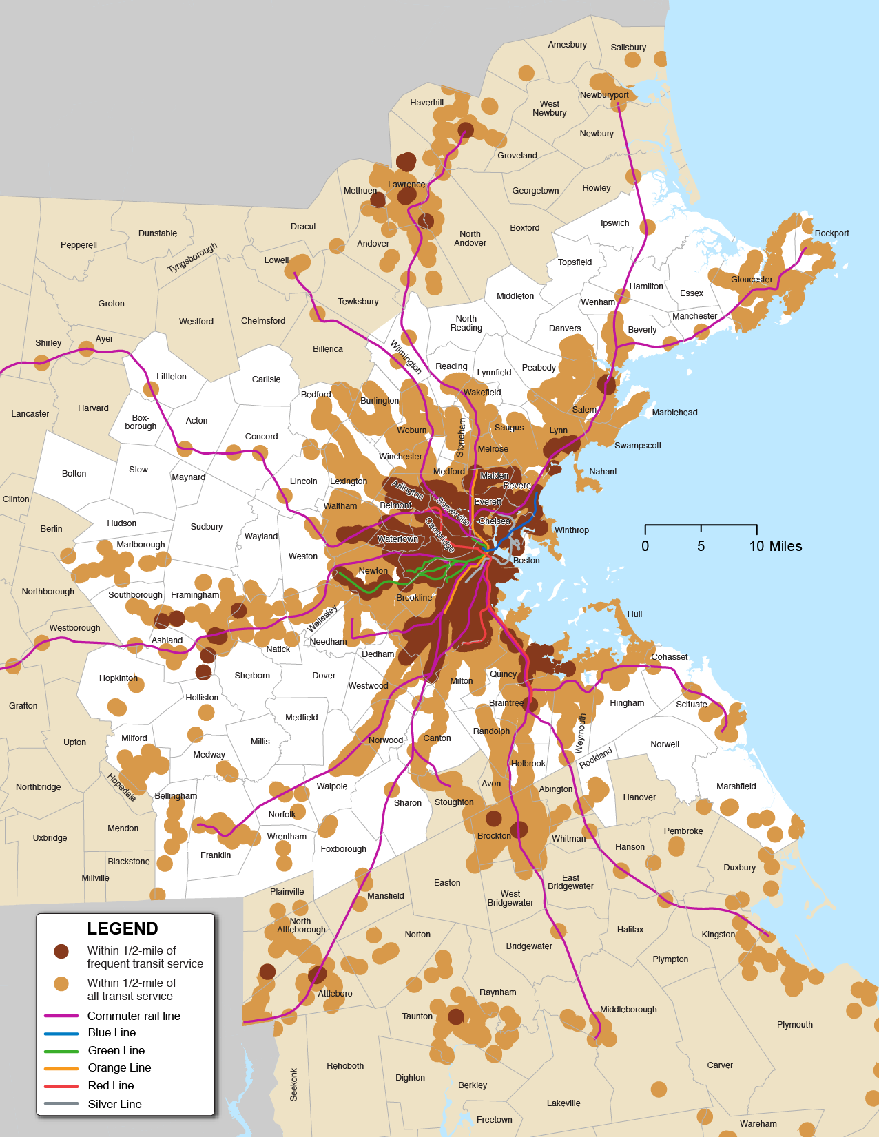
Tables 6-14 and 6-15 give an overview of the portion of the MPO’s population and employment that fall within one-quarter and one-half mile of an MBTA or RTA bus or ferry stop or an MBTA rapid transit or commuter rail station. It is further broken down by provision of frequent transit service, according to the definition laid out for dense areas in the MBTA Service Delivery Policy—service no more than every 15 minutes during weekdays and 20 minutes on weekends. A map of the Inner Core, Regional Urban Centers, Maturing Suburbs, and Developing Suburbs was shown in Chapter 2, Figure 2-2.
Table 6-14
Access to All Transit: Households and Employment 2016
Transit Market Area |
Employment (Number of Jobs) |
Percent of Employment |
Households |
Percent of Households |
Population |
Percent of Population |
Inner Core |
1,006,000 |
|
616,800 |
|
1,487,900 |
|
Within 1/4 mile |
911,500 |
91% |
562,200 |
91% |
1,350,300 |
91% |
Within 1/2 mile |
989,200 |
98% |
612,400 |
99% |
1,475,200 |
99% |
Regional Urban Centers |
307,700 |
|
234,200 |
|
566,200 |
|
Within 1/4 mile |
176,600 |
57% |
137,800 |
59% |
326,900 |
58% |
Within 1/2 mile |
248,900 |
81% |
185,200 |
79% |
442,000 |
78% |
Maturing Suburbs |
470,200 |
|
339,800 |
|
871,900 |
|
Within 1/4 mile |
159,200 |
34% |
91,800 |
27% |
229,000 |
26% |
Within 1/2 mile |
265,200 |
56% |
170,400 |
50% |
428,600 |
49% |
Developing Suburbs |
139,700 |
|
121,200 |
|
319,900 |
|
Within 1/4 mile |
11,600 |
8% |
7,600 |
6% |
19,400 |
6% |
Within 1/2 mile |
27,500 |
20% |
19,400 |
16% |
50,000 |
16% |
Source: Boston Region MPO .
Table 6-15
Access to Frequent Transit: Households and Employment 2016
Transit Market Area |
Employment (Number of Jobs) |
Percent of Employment |
Households |
Percent of Households |
Population |
Percent of Population |
Inner Core |
1,006,000 |
|
616,800 |
|
1,487,900 |
|
Within 1/4 mile |
714,600 |
71% |
369,400 |
60% |
886,200 |
60% |
Within 1/2 mile |
866,900 |
86% |
512,700 |
83% |
1,231,900 |
83% |
Regional Urban Centers |
307,700 |
|
234,200 |
|
566,200 |
|
Within 1/4 mile |
31,300 |
10% |
20,500 |
9% |
46,400 |
8% |
Within 1/2 mile |
58,500 |
19% |
48,400 |
21% |
112,700 |
20% |
Maturing Suburbs |
470,200 |
|
339,800 |
|
871,900 |
|
Within 1/4 mile |
4,000 |
1% |
2,500 |
1% |
6,400 |
1% |
Within 1/2 mile |
11,100 |
2% |
7,500 |
2% |
18,500 |
2% |
Developing Suburbs |
139,700 |
|
121,200 |
|
319,900 |
|
Within 1/4 mile |
0 |
0% |
0 |
0% |
0 |
0% |
Within 1/2 mile |
30 |
< 1% |
50 |
< 1% |
120 |
< 1% |
Source: Boston Region MPO .
Figures 6-11 and 6-12 show the areas within one-quarter mile and one-half mile of any transit and/or frequent transit service in the Boston region. As these analyses show, there are several, potentially complementary or overlapping paths to increasing transit’s share of the Boston region travel market in the coming years. Transit’s coverage, already significant,can be expanded throughout the region; transit’s frequency, high in some areas and not in others, can be increased to attract new riders; and land use can be planned to better align with transit. The MPO can support these efforts through planning, studies, and careful shepherding of available funds.
Figure 6-11
Areas within One-Quarter Mile of Transit and Frequent Transit in the Boston Region
Source: Boston Region MPO.
Figure 6-12
Areas within One-Half Mile of Transit and Frequent Transit in the Boston Region
Source: Boston Region MPO.
Park-and-ride lots are an important way for many riders to access the MBTA transit network. Table 6-16 shows the results of the 2015–17 MBTA Systemwide Passenger Survey, conducted by CTPS (on behalf of the MBTA), indicating initial access to the commuter rail and rapid transit system. Demand for park-and-ride lots is therefore significant in some areas of the system, but uneven throughout the region.
Table 6-16
Access to Commuter Rail and Rapid Transit Stations
Mode |
Commuter Rail (percent) |
Rapid Transit (percent) |
Walked or bicycled |
53 |
88 |
Drove alone |
31 |
4 |
Carpooled |
2 |
1 |
Dropped off by personal vehicle |
10 |
2 |
Dropped off by other vehicle |
4 |
5 |
Source: 2015–2017 MBTA Systemwide Passenger Survey.
In order to take a closer look at the need for additional parking, staff analyzed parking demand at rapid transit and commuter rail stations for both the 2016 base year and the 2040 No-Build. When looking at parking demand, the travel demand model is normally constrained to existing capacity at park-and-ride locations. In order to determine actual parking demand at existing park-and-ride locations for the Needs Assessment, the 2040 No-Build scenario was run unconstrained, assuming an unlimited amount of parking at each existing park-and-ride location.16
The results showing the demand for parking at the commuter rail stations (by rail line) are detailed in Figure 6-13 and results for parking at rapid transit stations are detailed in Figure 6-14. Table 6-17 shows the assumptions used for parking demand at commuter rail and rapid transit stations. Tables 6-18 and 6-19 show the existing park-and-ride capacity on each commuter rail and rapid transit line, and the projected unconstrained demand in relation to capacity in 2040.17 The existing park-and-ride capacity for 2012–13 shown in the table are the assumptions used in the travel model analysis. The park-and-ride capacity for 2017–2018 data is from the most recent inventory conducted by the Boston Region MPO, which is shown for information only.
Table 6-17
Assumptions for Demand at Commuter Rail and Rapid Transit Stations
Number of Parking Spots in Relation to Capacity |
Demand in Relation to Capacity (2016–40) |
Greater than 50 percent |
High demand |
26 percent to 50 percent |
Medium demand |
1 percent to 25 percent |
Low demand |
Less than 1 percent |
No demand |
N/A |
No parking available |
Source: Boston Region MPO .
Table 6-18
Commuter Rail: 2040 No-Build Parking Demand in Relation to Existing Capacity
Commuter Rail Lines |
Existing PNR Capacity (2012–13) |
Existing PNR Capacity (2017–18) |
Unconstrained Demand in Relation to Capacity |
Fairmount |
408 |
406 |
Low demand |
Fitchburg |
2,774 |
2,807 |
Low demand |
Franklin |
4,312 |
4,164 |
Medium demand |
Greenbush |
3,007 |
2,982 |
No demand |
Haverhill |
2,589 |
3,581 |
High demand |
Kingston/Plymouth |
4,841 |
5,015 |
No demand |
Lowell |
3,287 |
3,273 |
Medium demand |
Middleborough/Lakeville |
4,164 |
4,043 |
Low demand |
Needham |
1,405 |
1,384 |
High demand |
Providence/Stoughton |
9,718 |
10,531 |
Low demand |
Newburyport/Rockport |
3,663 |
4,620 |
Medium demand |
Worcester |
3,880 |
4,439 |
High demand |
Total |
44,048 |
47,245 |
Medium demand |
PNR = park-and-ride.
Source: Boston Region MPO.
Figure 6-13
Commuter Rail: 2040 No-Build Parking Demand in Relation to Existing Capacity
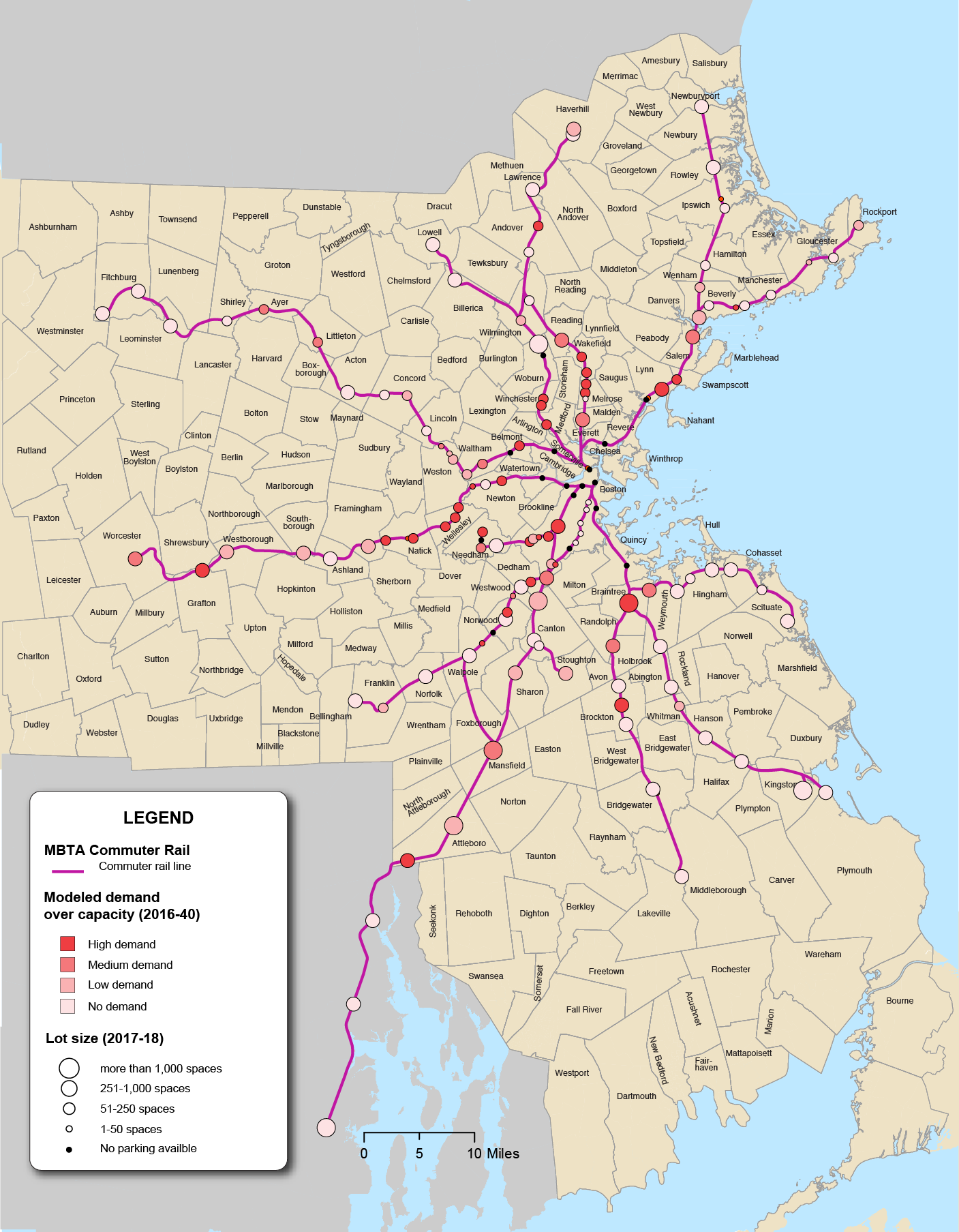
Source: Boston Region MPO.
Figure 6-14
Rapid Transit: 2040 No-Build Parking Demand in Relation to Existing Capacity
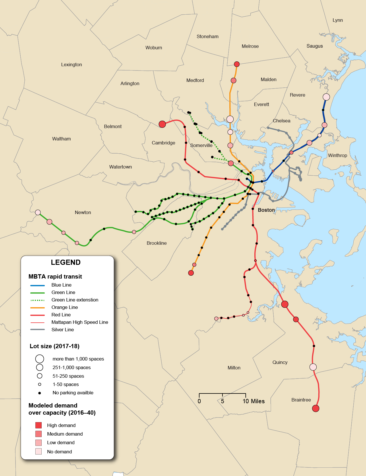
Source: Boston Region MPO.
Table 6-19
Rapid Transit: 2040 No-Build Parking Demand in Relation to Existing Capacity
Rapid Transit Lines |
Existing PNR Capacity |
Existing PNR Capacity |
Demand in Relation to Capacity |
Blue Line |
3,459 |
3,346 |
Low demand |
Green Line |
2,171 |
2,092 |
Low demand |
Green Line—Central Subway |
377 |
374 |
Medium demand |
Green Line—B |
0 |
0 |
No parking available |
Green Line—C |
5 |
0 |
No parking available |
Green Line—D |
1,789 |
1,718 |
Low demand |
Green Line—E |
0 |
0 |
No parking available |
Orange Line |
4,676 |
5,309 |
Medium demand |
Red Line |
8,238 |
7,764 |
High demand |
Mattapan |
301 |
290 |
Low demand |
Silver Line |
0 |
0 |
No parking available |
Total |
19,121 |
18,801 |
No demand |
PNR = park-and-ride.
Source: Boston Region MPO.
Based on the 2017–2018 inventory, there are approximately 47,000 park-and-ride spaces along the commuter rail lines. Results from the CTPS model (with unconstrained parking) show medium demand (26–50 percent) by 2040 for additional parking spaces beyond what is currently available. The highest demand is projected to be along the Haverhill, Needham, and Worcester lines, with the Greenbush, Kingston/Plymouth, and Fairmount lines projected to have excess capacity.
Currently, there are approximately 19,000 park-and-ride spaces along the rapid transit lines. CTPS analysis shows that there is low demand on the Blue and Green lines because large parking lots, such as those at Wonderland and Riverside stations, were not filled to capacity. The Orange and Red lines have higher demand for additional parking. Even with the model run assuming the demand for parking at commuter rail stations has no constraints, parking at shared commuter rail and rapid transit stations sustained high demand. In the North, stations such as Alewife and Malden were filled to capacity, despite “competing” trips on the Fitchburg and Haverhill commuter rail lines. And in the South, Braintree and Forest Hills stations had medium demand for additional parking, even with unconstrained park-and-ride lots near the Middleborough/Lakeville, Kingston/Plymouth, Providence/Stoughton, and Needham commuter rail lines.
Further analysis and planning is needed before park-and-ride capacity is expanded. In 2018, the MBTA modified parking prices at its park-and-ride lots and garages in response to demand.18 Close monitoring of that program, and others like it, can give a sense of the extent to which creative planning can mitigate the need for expansion of lots and garages. In addition, MassDOT is conducting its Rail Vision study which will identify key stations in which more frequent service may be provided. These key stations will take into account access to the stations with parking supply in relation to the current market and future growth potential. MPO programs such as the Community Transportation Program can also help with innovative ideas for reducing demand for car-based access to transit, as well as small capital projects that can increase capacity at parking lots.
In 2017, CTPS performed a study to help MassDOT prioritize segments of Greater Boston roadways that might benefit from dedicated bus lanes. Existing traffic speed data and bus passenger load data was used to assess the average weekday rate of bus passenger delay over roadway segments that carry on average more than 1,500 weekday MBTA bus passengers in one direction. One result of the study was the identification of segments where the installation of dedicated bus lanes would provide the most effective benefit to bus riders. A map of priority bus corridors identified in the study is shown in Figure 6-15. It also identifies existing on-street and off-street busways, on-street priority corridors, and on-street planned pilot projects as of April 2019.
Figure 6-15
Priority Bus Study Corridors in the Boston Region
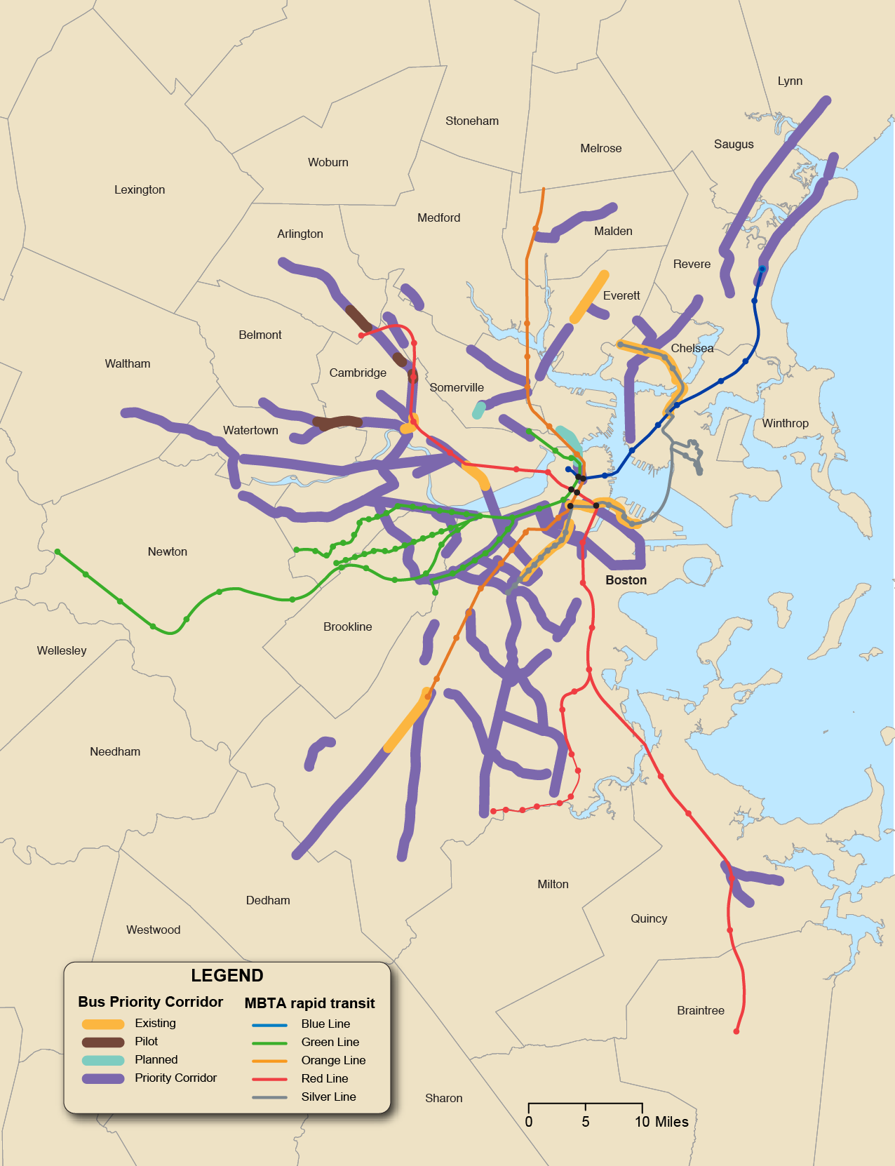
Source: Boston Region MPO.
With this study as the basis, staff looked at the results of the 2016 Base Year and 2040 No-Build to analyze bus load information in the future. As discussed in Chapter 3, bus ridership is projected to increase by only six percent from 2016 to 2040 due to congested roadways increasing travel times. Dedicated bus lanes could help to decrease transit travel time along these congested corridors.
Figure 6-16 shows the modeled change in ridership from 2016 to 2040 along the priority bus corridors identified in the CTPS study, as well as existing busways and planned or dedicated bus lane pilots. The corridors that show a reduction in ridership are mostly due to increased congestion along the corridors in the future. The Somerville Union Square corridor ridership reduction is a result of the new Green Line service siphoning off some of the demand for transit trips in the area. Although there is a projected reduction in these corridors, a dedicated bus lane could be beneficial to providing feeder service into rapid transit stations (Union Square corridor into the Green Line, North Washington Street into Sullivan Square and North Station, etc.).
As mentioned in the Priority Bus Corridors section above, bus travel times have increased as a consequence of the increasing congestion on the region’s roadways. With the MPO’s travel demand model projecting congestion to increase over the period of the next LRTP, buses are expected to see a corresponding decrease in speed which, in turn, increases run times.
Studies and research by CTPS staff and other entities have identified the possibility of increasing the number and quality of dedicated lanes for buses on the region’s roadways as a short-term transit priority improvement that can be implemented with relatively little capital expense. Everett, Cambridge, Arlington, Watertown, and Boston have (or are piloting) or have made permanent new dedicated bus lanes on different segments within the last several years. Figure 6-17 shows the modeled change in bus run times on Priority Bus Corridors, identified in the CTPS Study. The benefits of such lanes are shown in Figure 6-17, as buses traversing Washington Street in Roslindale and Broadway in Everett are expected to see decreased travel times over the period 2016–40 as a result of the implementation of dedicated bus lanes on those roads.
Figure 6-16
Modeled Change in Ridership on Priority Bus Corridors
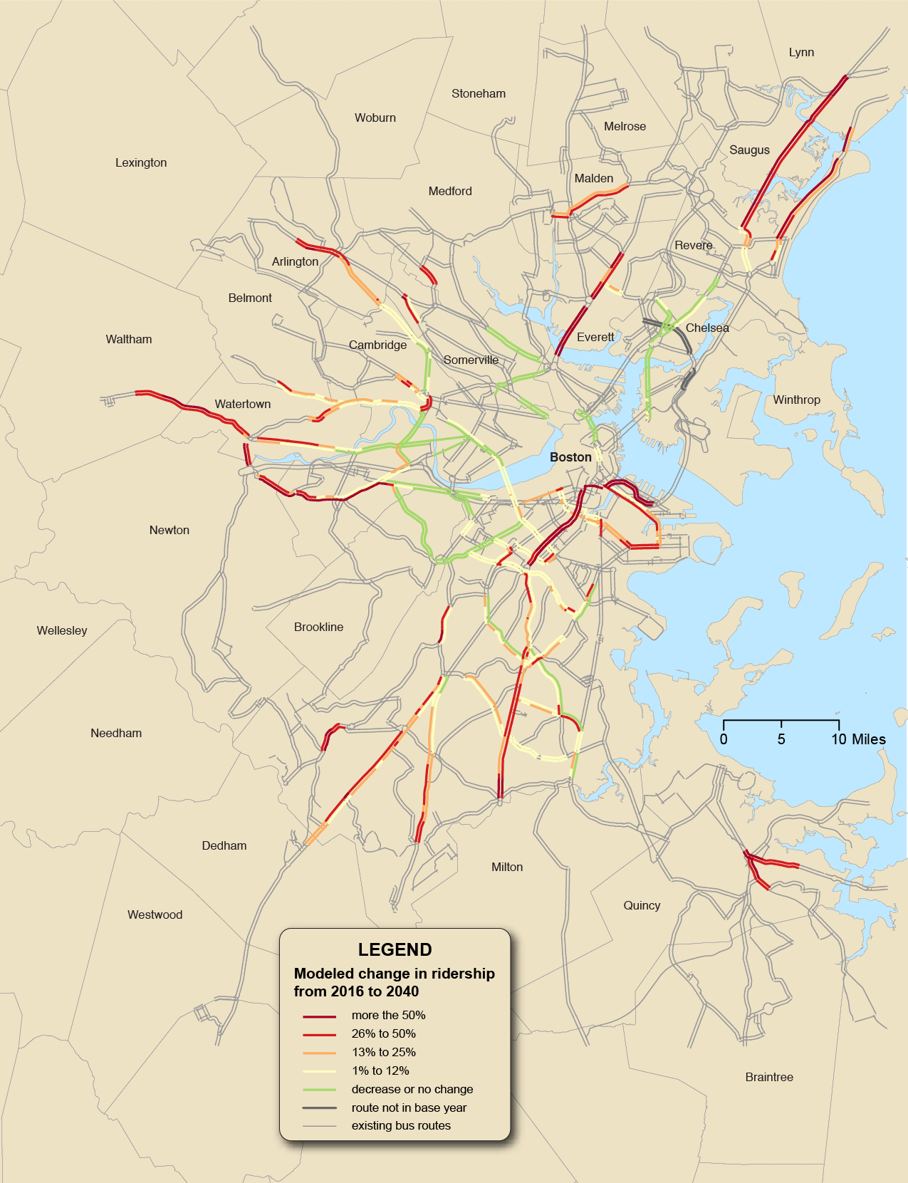
Source: Boston Region MPO.
Figure 6-17
Modeled Change in Bus Run Times on Priority Bus Corridors
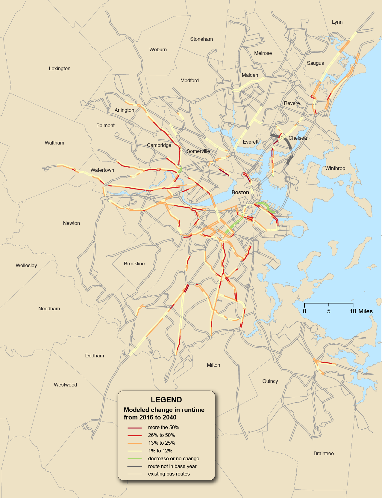
Source: Boston Region MPO.
The MBTA is also working with municipalities to roll out Transit Signal Priority (TSP) technology on many corridors; MPO staff has assisted in that effort through the FFY 2018 UPWP study Review of and Guide to Implementing Transit Signal Priority in the MPO Region.19 The rollout of the MBTA’s Automated Fare Collection (AFC 2.0) system in the coming years is expected to allow all-door boarding on bus routes, speeding up service. Such strategies hold significant promise for speeding up bus service and making it more reliable.
Much like the region’s roadway system, the region’s transit services and networks face reliability and capacity management concerns. Buses, trackless trolleys, and shuttles operating on roadways are affected by the increasing traffic congestion documented above. The size of vehicle fleets, the capacity of individual vehicles, and the condition of vehicles and infrastructure all have an impact on the number of passengers that can be moved and the ability of services to adhere to schedules. Transit planners and schedulers take into account poor reliability and adjust running times to be longer, meaning it takes more buses to make the same number or fewer scheduled trips; this can result in crowding.
As much of the MBTA’s rapid transit infrastructure and rolling stock is aging, reliability has been poor in recent years, even as ridership demand increases. Bus reliability is also poor, in large part, because of overall roadway congestion. Regional bus ridership has fallen notably in recent years, potentially as a consequence of this unreliability.20 TNCs may also play a role in decreasing bus ridership. However, as overall regional travel demand and congestion are increasing, transit—which is among the most efficient ways to use available road capacity—remains key not just to a sustainable regional future but to a future where mobility is preserved for regional residents.
The challenges facing the MBTA rapid transit system are well-documented, most notably in the State of the System materials accompanying the MBTA’s Focus40 planning process. Much of the system (including track infrastructure and rolling stock) is aging and as ridership has grown, and the capacity of the system has become strained, this has resulted in relatively poor reliability—especially on the Green Line.
However, significant renewal processes are underway. New rolling stock and signals are due for the Orange and Red Lines within the next decade, and the MBTA has begun a Green Line Corridor Study, including the possibility of new, modern rolling stock and signals to determine the future of the Green Line system. The Blue Line has modern rolling stock and fewer capacity and reliability challenges than other lines. The coming implementation of a modern fare-collection system, known as AFC 2.0, should allow all-door boarding and thereby improve boarding times and reliability on the surface sections of the Green Line. The MPO can continue to monitor the rapid transit system, contribute expertise to its planning, and study the possibilities for future expansion and further capacity enhancement as the region grows.
Figure 6-18
MBTA Rapid Transit Reliability, 2018
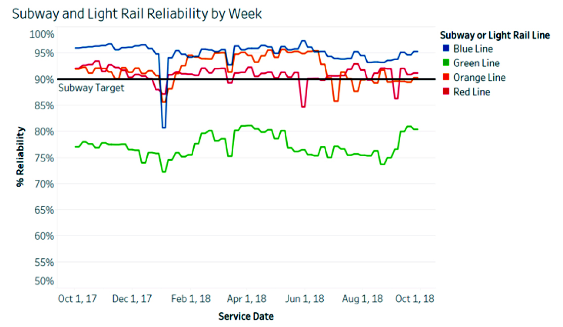
MBTA = Massachusetts Bay Transportation Authority.
Source: MBTA’s Fiscal Management Control Board’s Fourth Annual Report, https://cdn.mbta.com/sites/default/files/fmcb-meeting-docs/reports-policies/2018-12-17-fmcb-annual-report-original.pdf.
While MBTA commuter rail reliability has somewhat recovered since the winter of 2014–15, a number of physical and infrastructure factors must still be addressed. The rolling stock—both coaches and locomotives—is aging, and some coaches are not American Disabilities Act (ADA)-compliant. The signal system, while modern in some places, is many decades old and in need of improvement in others. Some lines lack layover capacity for midday or overnight train storage. Some bridges and other track structures are aging and maintenance-intensive as well. Platforms at 32 stations are “low” (track level) and are not ADA-compliant, while 58 stations have only a “mini-high” platform for minimal ADA compliance.21 This means that most riders must climb stairs to enter or exit the train, a slow and complex boarding and alighting process that introduces significant variability in dwell time—and therefore in reliability—to the system.
Figure 6-19
Commuter Rail Reliability, 2018
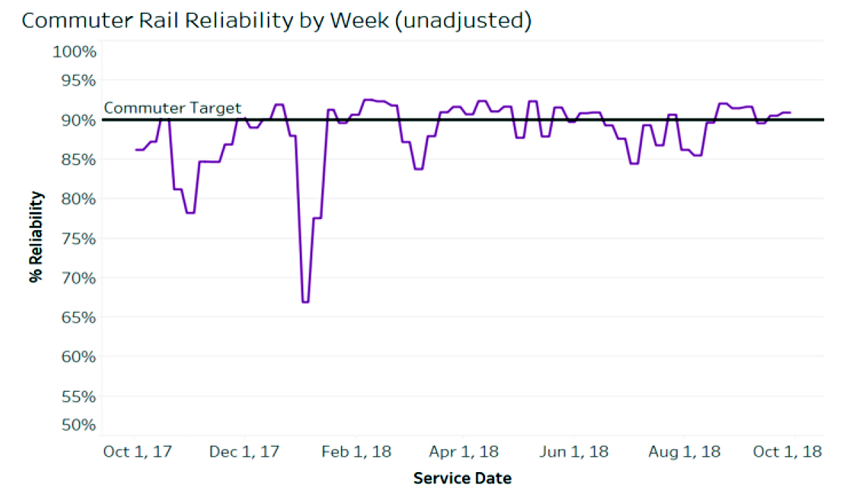
Source: MBTA FMCB Fourth Annual Report.
The MBTA is currently conducting a multiyear Commuter Rail Vision study to determine potential future scenarios for the system, including comparisons to international regional rail systems that provide frequent, modern service. At the same time, the MBTA’s Fiscal Management Control Board (FMCB) is overseeing station improvements, fleet modernization, and general state of good repair projects. Over the next several years, the MPO and its staff can help provide input on potential best practices and operating and infrastructural scenarios, identify areas where the commuter rail system can be coordinated with RTAs and other transit services, and identify priorities for reliability and accessibility improvements—such as ensuring as many stations as possible receive high-level platforms.
Given the increased congestion on regional roadways, especially arterials (as mentioned in the Roadway section), it is not surprising that the reliability of the MBTA’s bus system is poor. Maintaining a reliable bus system is especially important because buses can provide significant capacity for little capital investment. They are also disproportionately used by low-income and minority riders in Boston, as in many metropolitan areas around the United States. As Figure 6-20 shows, when evaluated in 2017, a clear majority of MBTA bus routes failed the Service Delivery Policy’s test for reliability.22
While MBTA service planners periodically adjust running times to address reliability issues, doing so frequently results in longer trips and morecrowded vehicles which may not ultimately improve reliability. As data presented to the MBTA’s FMCB at the end of 2018 showed, bus service reliability continues to be a significant challenge (see Figure 6.21).
The Priority Bus Corridors section above lays out one potential approach to improving the challenge of unreliable bus service. Several independent research reports have also suggested that modernizing dispatching and supervision practices could reduce bunching and improve overall reliability on the MBTA bus and rail networks.23 Improvements such as transit signal priority and the MBTA’s intended adoption of AFC 2.0, with riders being able to board buses at all doors, should have some positive impact on reliability in coming years, however, the extent of that impact remains to be determined. As congestion grows in the MPO region, a thoughtful approach to monitoring improvements (such as AFC 2.0 and using buses and other surface transit to maximize the capacity of the overall network) will become even more significant in the future.
Figure 6-20
Routes Passing and Failing MBTA Service Delivery Policy Bus Reliability Test, 2016
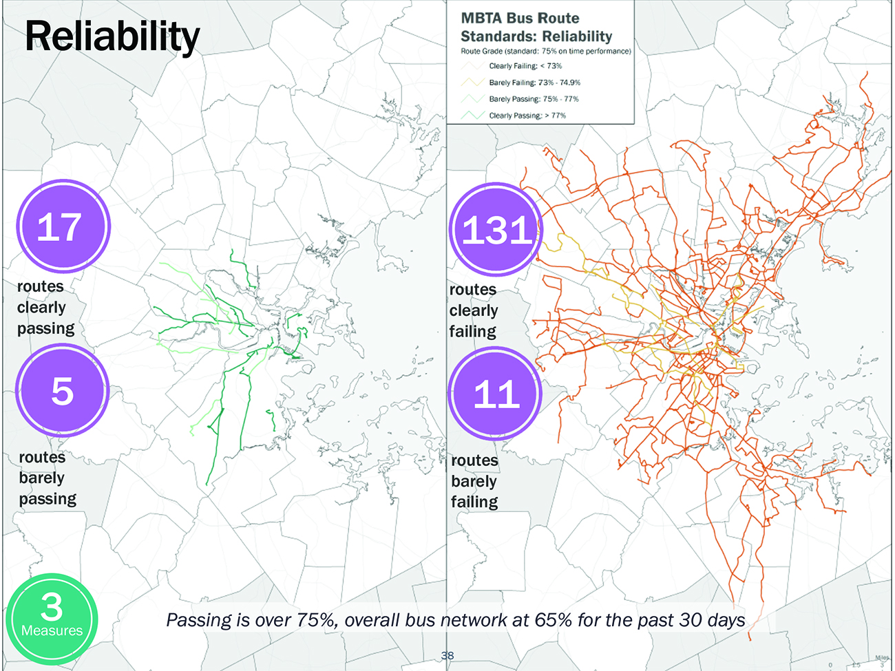
MBTA = Massachusetts Bay Transportation Authority.
Source: MassDOT. “Service Delivery Policy Workshop,” October 2016. https://cdn.mbta.com/uploadedfiles/About_the_T/Board_Meetings/Service%20Delivery%20Policy%20-%20Final%20To%20Upload(2).pdf.
Figure 6-21
MBTA Bus Reliability, 2018
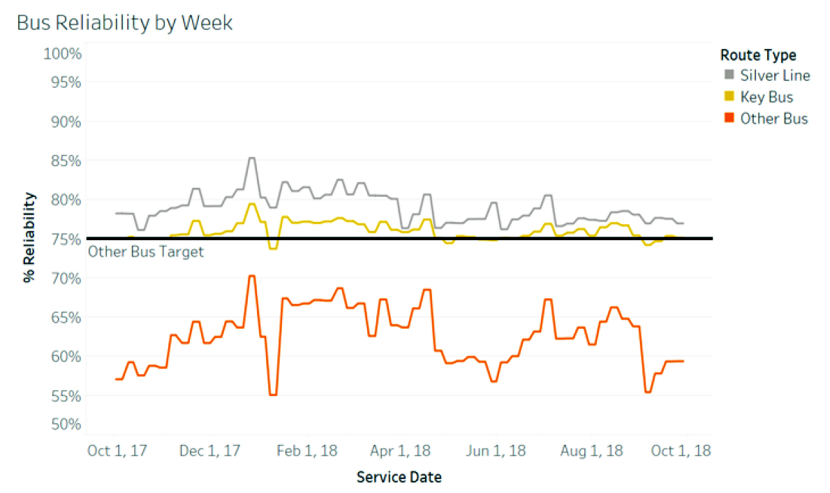
MBTA = Massachusetts Bay Transportation Authority.
Source: MBTA’s Fiscal Management Control Board’s Fourth Annual Report.
Recent growth in population and employment has stressed the MBTA system. Adding capacity is never easy regardless of economic, fiscal, or political conditions. Capacity can be added by expanding or modernizing the rail network or the vehicle fleet, or sometimes by changing operating practices. This process begins with some type of needs assessment, such as this one.
The MPO’s recent report, Core Capacity Constraints: Accommodating Growth on Greater Boston’s Congested Road and Crowded Transit System, specifically examined the problem of crowding in the rapid transit system, reaching the key conclusion that rapid transit crowding is a problem now and will be significantly more so in 2040.24 Furthermore, the crowding problem impacts all other planning considerations. For instance, any proposal to extend an existing rapid transit line would exacerbate crowding on that line and throughout the rapid transit system.
The “Core Capacity” report is briefly summarized below, presenting the general approach and several specific findings. Please refer to the report for a full account of locations, time periods, duration, and severity of crowding throughout the system that exists today or is forecasted in the future. References to the 2040 projections in this section refer to a modeling process done in support of the Core Capacity report, separate from the one carried out for the rest of the Needs Assessment.
The first phase of the “Core Capacity” study included a review of MBTA and international crowding standards, which is expressed as square feet per standing passenger, using a metric of 3.11 square feet per standing passenger as the smallest acceptable amount. The MBTA has different sizes and configurations of rapid transit equipment, and depending on the particular vehicle, this maximum level would imply that there are between 21 and 43 percent more standing passengers than seated passengers if all the seats are occupied. This maximum level of passenger crowding is illustrated in Figure 6-22.
Figure 6-22
Maximum Acceptable MBTA Load
(3.11 Square Feet per Standing Passenger)
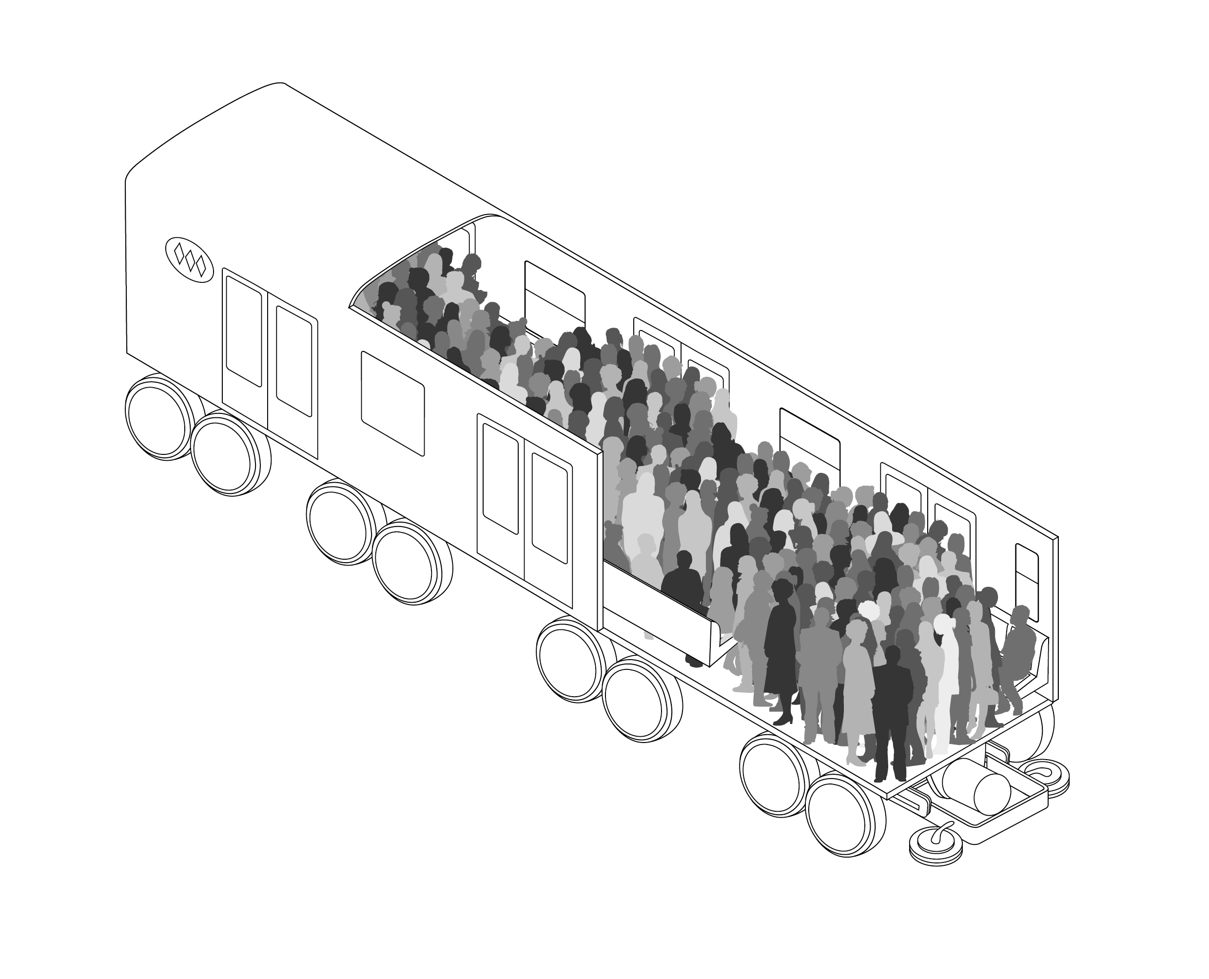
Source: Batarce, Marco, Juan Carlos Muñoz, Juan de Dios Ortúzar, Sebastian Raveau, Carlos Mojica, and Ramiro Alberto Ríos Flores (2015) “Valuing Crowding In Public Transport Systems Using Mixed Sp/Rp Data: The Case of Santiago” Transport Research Record.
The “Core Capacity” study looked at every line segment between adjacent rapid transit stations, in each direction, for every 15 minute period between the peak-periods of 6:00 AM and 9:00 AM and 3:00 PM and 6:00 PM. These data were prepared for a base year of 2012, and two 2040 growth scenarios. These forecasts were based on project-based land use projections. The lower growth scenario was slightly below the official MPO demographic forecasts, and the higher growth scenario was slightly above the official forecasts. The forecasts were developed to test the impact on the transportation system on sets of individual projects rather than to replicate official MPO forecasts.
Table 6-20 presents selected results of this analysis. In 2012, every transit line except the Blue Line experienced unacceptable crowding at some point on the line on a regular basis. The Red and Orange Lines had some well-defined pinch points, but the Green Line, closely aligned with Boston’s “High Spine” development plan, experienced unacceptable crowding throughout most of its tunnel system.25
Table 6-20 also indicates locations of unacceptable 2040 crowding, assuming the lower growth projection. The table indicates the additional locations in the rapid transit system where unacceptable crowding is anticipated. However, the duration and severity of crowding is expected to increase in the system segments shown as crowded in 2012. This is the case for the Green Line, where the central tunnel is almost entirely congested in both 2012 and 2040, but appreciably worse in 2040.
Table 6-20
Stations Adjacent to a Line Segment Experiencing Unacceptable
Crowding on a Regular Basis during Peak Periods
Year |
Red Line |
Orange Line |
Green Line |
Blue Line |
2012 |
Kendall/MIT |
State |
Park |
|
2040 |
Kendall/MIT |
Sullivan |
Park |
State |
Source: Boston Region MPO.
If the high growth scenario takes place throughout the MPO region, unacceptable crowding will be more extensive and more severe than indicated in this table. However, the MBTA is making investments in service and capacity that could relieve pressure, such as new rolling stock and signals on the Orange and Red Lines, and potentially a future Green Line Transformation program.
Despite recent losses in ridership, crowding remains a concern on parts of the regional bus network. The MBTA has identified crowding on buses as one of the elements most important to its riders and integrated metrics measuring it into the agency’s new Service Delivery Policy.26 Crowding remains a barrier to ridership and interacts in a negative cycle with unreliable service; crowding increases bus dwell times, which in turn causes bunching of buses, which decreases overall capacity on the line, and therefore the entire transportation network.
MBTA conducted a thorough review of crowding on its bus network as part of the process of developing the Service Delivery Policy. This review was presented to the MassDOT board and MBTA’s FMCB in 201727 ; Figures 6-23 and 6-24 demonstrate elements of the crowding analysis presented at that meeting. Figure 6-24 shows the different types of crowding on the Number 9, 66, and 111 bus routes.
Figure 6-23
MBTA Bus Route Crowding Analysis: Average Weekday, Fall 2015
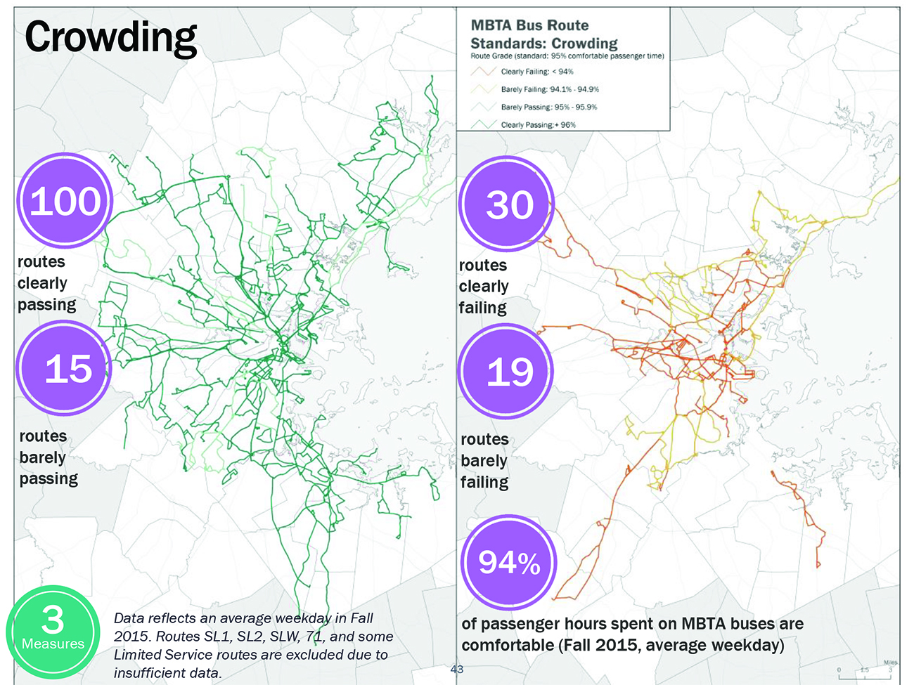
Source: Massachusetts Bay Transportation Authority.
Figure 6-24
Different Types of Bus Crowding
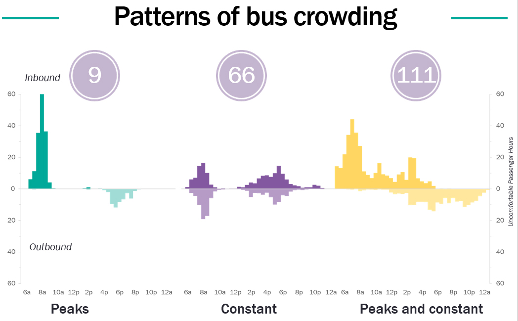
Source: Massachusetts Bay Transportation Authority.
Table 6-21 shows the bus routes considered by the MBTA bus crowding standard to have above-average amounts of crowding as of fall 2017, the most recent data available at the time of publication.
Table 6-21
Most Crowded MBTA Bus Routes, Fall 2017
Route |
Route Type |
Percentage of |
111 |
Key Bus |
21.01% |
65 |
Local |
20.69% |
57A |
Key Bus |
19.63% |
7 |
Local |
17.82% |
109 |
Local |
15.50% |
9 |
Local |
14.39% |
34 |
Local |
11.43% |
117 |
Key Bus |
10.73% |
93 |
Local |
10.73% |
57 |
Key Bus |
10.70% |
47 |
Local |
10.11% |
Note: Data is provided by the MBTA Bus Crowding Model. Excludes privately operated routes: 710, 712, 713, 714, 716. Excludes routes operated as pay-on-exit: 71, 72, 73. This excludes routes accepting passengers at gated stations 741, 742, 746
Source: Massachusetts Bay Transportation Authority.
Crowding is generally not considered to be a problem on the bus systems of non-MBTA RTAs operating in the MPO region.
While crowding has been identified by stakeholders as a concern on the commuter rail network, sufficient data to measure it accurately does not exist at this time. CTPS recently conducted commuter rail counts for MassDOT and the MBTA, which will (when sufficiently processed) allow for a crowding analysis. Crowding is not a concern on ferries because federal regulations prohibit the passenger load from exceeding the boat’s seated capacity.28
The State of the System reports undertaken by the MBTA as part of the Focus40 process identify outdated and overcrowded bus garages and depots as a major need for the MBTA. Four of the MBTA’s nine maintenance facilities are over 70 years old; most are at capacity and cannot expand to meet service demand and reduce crowding. Expansion will require new facilities, new land, or the intensification/layering of current land use.
Many facilities are obsolete and the ratio of buses to repair bays is too high. Those most in need of replacement are Fellsway, Lynn, and Quincy, while Albany and Arborway (which was intended to be a temporary facility) need major upgrades. The intention to trial and/or adopt battery electric buses, which are taller than diesel buses, is an additional challenge to the MBTA’s garages and facilities; while some routes are already straining at the edges of capacity, few of the system’s facilities can handle the 60-foot articulated buses that might help relieve crowding.
On the positive side, most transit systems do not have an asset like the central repair facility in Everett. Expansion of the MBTA’s maintenance facilities or adding new facilities is a major need, but also financially and potentially politically challenging. The MPO can help reduce this need by working with municipalities to site new garages and providing technical support and data to the MBTA to help optimize garage siting and minimize deadhead travel for buses.
MPO staff received comments during outreach on needs from fall 2017 through spring 2018 on the Capacity Management/Mobility goal area. The following is a summary of comments by transit mode and other themes.
Respondents felt that it was important to improve the quality of service throughout the transportation network, but particularly on public transit. This interest was highlighted by state and municipal officials, transportation advocates, COAs, disability advocates, business and neighborhood development organizations, transit service providers, transit riders, and residents. Concerns centered on topics such as
As this section has demonstrated, the needs of the region’s transit system are extensive. They include the need to:
Many of the MBTA’s infrastructure needs are programmed for renewal or consideration under that agency’s coming plans, but the MPO should continue to monitor developments and assist with planning and analysis as needed. The MPO can also serve as an important locus of coordination between municipalities, transit agencies, and state agencies—a need voiced frequently during public outreach.
The MPO has established objectives under its Capacity Management and Mobility goal to
This goal reflects the potential of both walking and bicycling to provide an efficient transportation network capacity and an environmentally sustainable mode of travel.
The potential for increasing walking and bicycling varies by geography and land use with the greatest room for growth existing in the maturing suburbs, regional urban centers, and developing suburbs of the region. When homes, jobs, and destinations are located in close proximity to each other, planners can create a robust, safe, and extensive network of pedestrian and bicycle infrastructure which could increase bicycle and pedestrian mode shares. When facilities are integrated into well-connected networks, they support trips both between and within the region’s communities.
Federal, state, regional, and local initiatives supporting Complete Streets projects emphasize the collective interest in integrating and enhancing the role of bicycle and pedestrian modes in the transportation system. For example, MassDOT issued its Complete Streets design standards and related Healthy Transportation Policy Directive to ensure that MassDOT projects are designed and implemented so that all customers have access to safe and comfortable walking, bicycling, and transit options.
The following section describes bicycle-specific and pedestrian-specific needs identified through MPO research and analysis.
Bicycle:
Pedestrian:
In 2019, MassDOT released its Massachusetts Bicycle Transportation Plan (Bicycle Plan) with the following vision: “Biking in Massachusetts will be a safe, comfortable, and convenient option for everyday travel.” To that end, the Bicycle Plan lists two main goals:
The type of bicycle facility at a given location greatly influences user comfort, which directly impacts the perceived convenience and attractiveness of biking for everyday travel.
MPO staff recognizes the importance of understanding the different levels of protections and comfort offered by bicycle infrastructure. Since high-quality protected or separated bicycle infrastructure garners considerably more usage and is much safer for all road users, staff explored how to define a “Bicycle Level-of-Service Metric” through a FFY 2018 UPWP study.30 31 In addition, staff sought to sharpen the analysis of residential and employment proximity to bicycle infrastructure contained in the last Needs Assessment (2015).
Using MAPC’s continuously updated Trailmap application that maps and classifies active transportation infrastructure in the Boston region (located here: https://trailmap.mapc.org/), staff specifically mapped bicycle facilities in the MPO region and analyzed how many residents and jobs were located near high-quality infrastructure.32 Figure 6-25 shows the locations of the high- and medium-quality bicycle infrastructure in the whole MPO region, while Figure 6-26 shows locations of bicycle infrastructure in the Inner Core in two categories: high- and medium-quality (roughly, infrastructure that offers physical separation from automobile traffic), and low-quality. Table 6-22 breaks down the access that high- and medium-quality bicycle infrastructure provides to residents and jobs in the region, while Table 6-23 shows access to all bicycle infrastructure in the MPO region.
Table 6-22
Access to High-Quality and Medium-Quality Bicycle Infrastructure in the Boston Region
High- and Medium-Quality Bicycle Infrastructure |
Employment |
Percent of Employment |
Households |
Percent of Households |
Population |
Percent of Population |
Inner Core |
1,006,000 |
|
616,800 |
|
1,487,900 |
|
Within 1/4 mile |
698,700 |
69% |
320,600 |
52% |
760,700 |
51% |
Within 1/2 mile |
896,200 |
89% |
502,300 |
81% |
1,207,300 |
81% |
Regional Urban Centers |
307,700 |
|
234,200 |
|
566,200 |
|
Within 1/4 mile |
72,600 |
24% |
55,900 |
24% |
134,500 |
24% |
Within 1/2 mile |
143,900 |
47% |
114,300 |
49% |
276,300 |
49% |
Maturing Suburbs |
470,200 |
|
339,800 |
|
871,900 |
|
Within 1/4 mile |
104,100 |
22% |
62,600 |
18% |
160,100 |
18% |
Within 1/2 mile |
198,500 |
42% |
132,100 |
39% |
338,700 |
39% |
Developing Suburbs |
139,700 |
|
121,200 |
|
319,900 |
|
Within 1/4 mile |
15,200 |
11% |
11,100 |
9% |
29,200 |
9% |
Within 1/2 mile |
29,900 |
21% |
23,100 |
19% |
60,600 |
19% |
Source: Boston Region MPO.
Figure 6-25
High-Quality and Medium-Quality Bicycle Infrastructure in the Boston Region
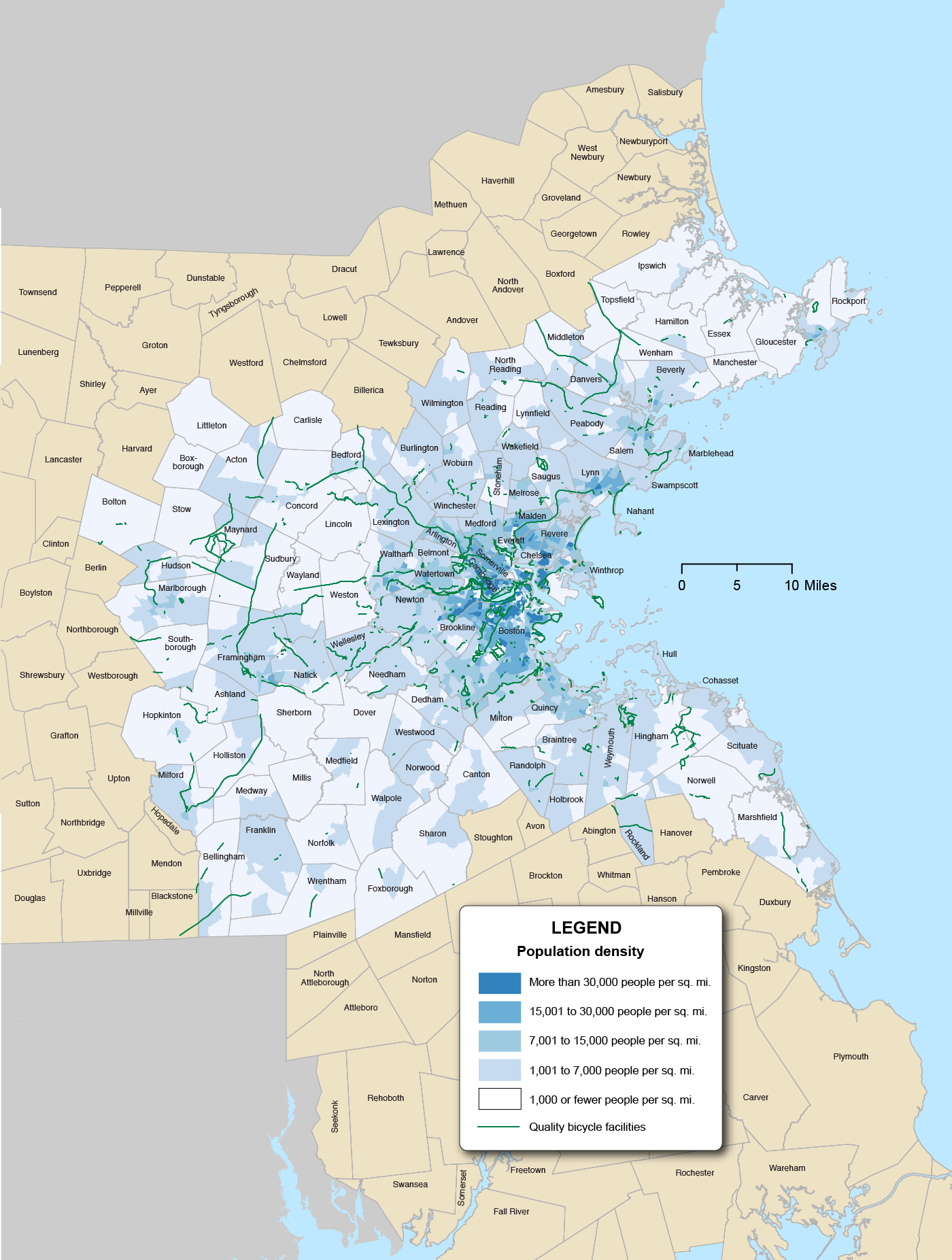
Source: Boston Region MPO.
Table 6-23
Access to All Bicycle Infrastructure in the Boston Region
All Bicycle Infrastructure |
Employment |
Percent of Employment |
Households |
Percent of Households |
Population |
Percent of Population |
Inner Core |
1,006,000 |
|
616,800 |
|
1,487,900 |
|
Within 1/4 mile |
869,200 |
86% |
474,500 |
77% |
1,129,800 |
76% |
Within 1/2 mile |
955,500 |
95% |
571,600 |
93% |
1,374,700 |
92% |
Regional Urban Centers |
307,700 |
|
234,200 |
|
566,200 |
|
Within 1/4 mile |
88,400 |
29% |
65,700 |
28% |
157,100 |
28% |
Within 1/2 mile |
162,500 |
53% |
126,600 |
54% |
304,700 |
54% |
Maturing Suburbs |
470,200 |
|
339,800 |
|
871,900 |
|
Within 1/4 mile |
126,300 |
27% |
75,400 |
22% |
192,900 |
22% |
Within 1/2 mile |
237,100 |
50% |
152,700 |
45% |
391,400 |
45% |
Developing Suburbs |
139,700 |
|
121,200 |
|
319,900 |
|
Within 1/4 mile |
15,900 |
11% |
11,900 |
10% |
31,200 |
10% |
Within 1/2 mile |
31,200 |
22% |
24,200 |
20% |
63,400 |
20% |
MPO = metropolitan planning organization.
Source: Boston Region MPO.
While bicycle, pedestrian, and shared infrastructure offers the promise of cheap, easy, and space-efficient capacity to the transportation network, there are still challenges remaining as to its implementation in the Boston Region MPO area. Rather than forming a coherent network, high-quality infrastructure has been built out project by project. This leads to trips that may begin or end on a comfortable path separated vertically or horizontally from other modes but may involve segments along on-street bike lanes or streets with sharrows (shared-lane markings) that many potential bicyclists regard as unsafe. Many underprivileged populations, such as low-income residents who could most benefit from inexpensive or free transportation, lack convenient access to bicycle infrastructure.
Figure 6-26
Map of All Bicycle Infrastructure in the Inner Core
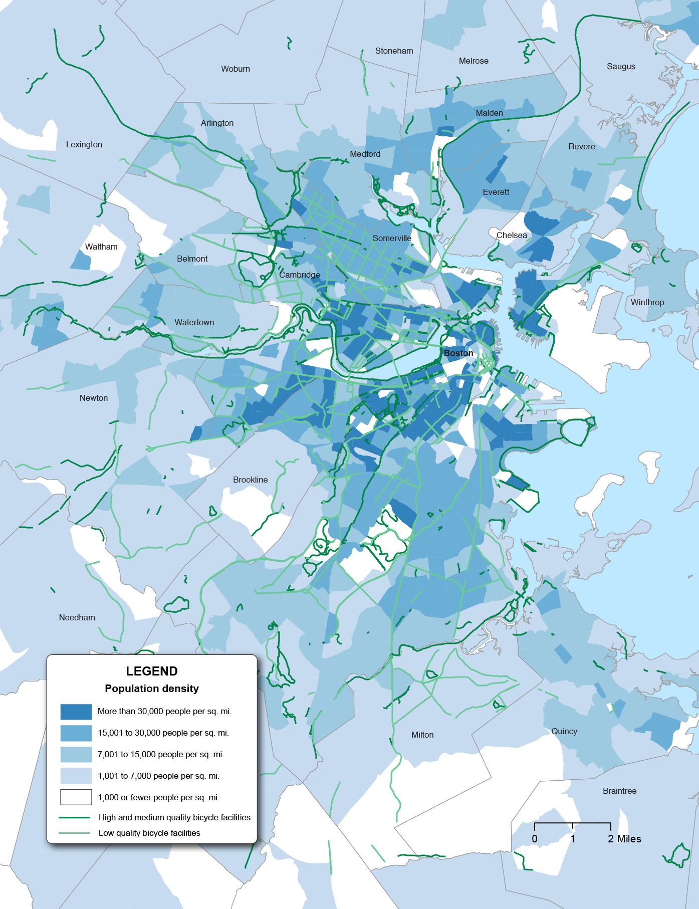
Source: Boston Region MPO.
In 2015, the MPO established a bicycle and pedestrian funding program as part of Charting Progress to 2040. This program provides an opportunity for the MPO to take the lead on creating a coherent network across multiple municipalities by prioritizing its own bicycle/pedestrian funding by network value; coordinating efforts between municipalities, state agencies, and other actors; and continuing to study and research best practices and the value of safe infrastructure.
Since the last Needs Assessment, the Boston region and the entire country have seen dramatic growth in the popularity and prevalence of bike-sharing—a type of shared-use mobility where bicycles owned by a company or entity are made available for public use, typically for a small fee or subscription. This is also shown below in Figure 6-27.
Figure 6-27
National Growth of Bike-Share Usage
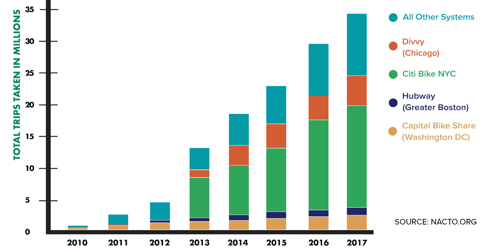
Source: National Association of City Transportation Officials (NACTO) Bike-Share in the U.S., 2017. https://nacto.org/bike-share-statistics-2017/.
The Boston region’s major bike-share system, BLUEBikes (previously named Hubway) launched in 2011 and has enjoyed the support of Boston, Cambridge, Brookline, and Somerville. The system, operated by the major bike-share operating company Motivate, has continually grown its system of docks and is currently in the planning stages for major expansion throughout its member municipalities. Figure 6-28 shows the locations of the docks in the MPO area.
While BLUEBikes station locations are largely determined by member municipalities (with consultation provided by MAPC), the MPO continues to monitor system capacity and expansion, works to align the system with regional bicycle infrastructure, measures the impact of bike-share on the overall network, and addresses equity and access concerns. Table 6-24 analyzes proximity of employment, households, and population to BLUEBike docks in its member municipalities.
Table 6-24
Access to BLUEBikes (Docked Bike-Share) in Municipalities Served
Bike-Share |
Employment |
Percent of Employment |
Households |
Percent of Households |
Population |
Percent of Population |
Boston |
613,300 |
|
281,300 |
|
676,400 |
|
Within 1/4 mile |
507,300 |
83% |
178,800 |
64% |
420,900 |
62% |
Within 1/2 mile |
567,000 |
92% |
237,800 |
85% |
567,000 |
84% |
Brookline |
21,100 |
|
26,700 |
|
60,400 |
|
Within 1/4 mile |
12,100 |
57% |
13,600 |
51% |
29,700 |
49% |
Within 1/2 mile |
17,600 |
83% |
23,000 |
86% |
50,300 |
83% |
Cambridge |
115,900 |
|
49,100 |
|
119,100 |
|
Within 1/4 mile |
102,100 |
88% |
41,300 |
84% |
101,700 |
85% |
Within 1/2 mile |
114,600 |
99% |
48,700 |
99% |
118,300 |
99% |
Somerville |
26,600 |
|
34,700 |
|
80,400 |
|
Within 1/4 mile |
18,300 |
69% |
25,600 |
74% |
59,100 |
74% |
Within 1/2 mile |
26,400 |
99% |
33,600 |
97% |
78,000 |
97% |
Note: Only includes docked bike-share stations operated by BLUEBikes. The docked bike-share operated by Zagster in Marlborough and Salem was not included because data on the size and location of their fleet could not be found. Many other communities in the Boston Region MPO have dockless bike-shares (Figure 6-27) that could not be tracked as the locations of bicycles are not fixed.
Source: Boston Region MPO.
The past year has also seen rapid growth in a new bike-share paradigm, known as dockless bike-share. In this system, rather than returning bikes to a physical dock, users “unlock” bikes using a smartphone app and pick up or leave the bike anywhere within a predefined service area. Nationally, dockless bike-share operators installed around 44,000 dockless bikes in 2017, making up about 44 percent of the total number of bike-share bikes in the United States, and contributing to a doubling of the overall number of bike-share bikes available in the country.33 However, the National Association of City Transportation Officials (NACTO) estimates that only four percent of bike-share trips were taken on dockless bikes in the United States in 2017.
Figure 6-28
BLUEBike Dock Locations
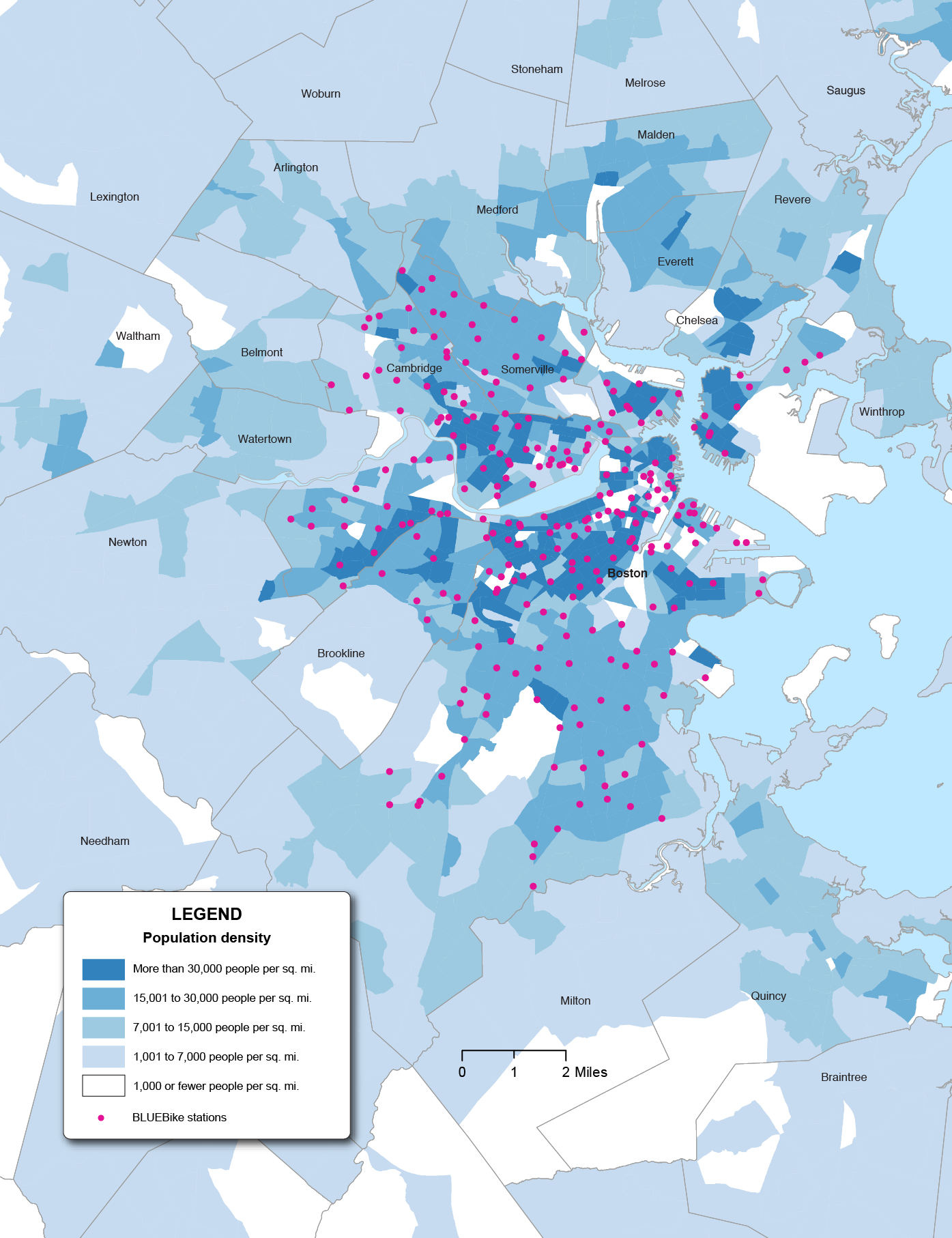
Source: Boston Region MPO.
Dockless bike-share has also increased in the Boston region. MAPC has led a 16-community effort to bring bike-share to various suburban communities, and different municipalities have partnered with operators to provide dockless bikes. Figure 6-29 (below) shows the municipalities that have partnered with a dockless bike-share company as of November 2018.
While dockless bike-share is a new operating paradigm in the United States, its business model and future popularity appear uncertain at times. For instance, the October 2018 national publication, Streetsblog, published an article asking, “Is Pedal Dockless Bike-share Going Extinct?”34 As of spring 2019, other dockless technologies, such as pedal-assist electric bikes and electric scooters, were becoming common in many cities, but the financial viability of the companies promoting them, and the regulatory framework that would allow them to continue to function, remained unclear. As of March 2019, Brookline was the first and only Massachusetts municipality to officially provide for electric scooter share, although the status of such vehicles in state law remained ambiguous.35 The MPO will continue to monitor its development and coordinate with MAPC and regional communities to plan for increased adoption of dockless bike- and scooter-share and other such “micromobility” solutions as a benefit to regional mobility.
An inventory of the location, extent, and condition of the region’s sidewalks and walkways is scarce, and there is a need to supplement this inventory with ongoing data collection and analysis. MassDOT released its Massachusetts Pedestrian Transportation Plan (Pedestrian Plan) in 2019, in which it lists several initiatives to meet the vision and goals defined in the Pedestrian Plan. The sixth initiative, “invest in data collection to inform Initiatives 1-5 and to track progress” is supported by MassDOT’s commitment to inventory and collect condition information for sidewalks, roadway crossings, and off-street paths.36 MassDOT further states that the information will be integrated into the MassDOT asset management database and geographic information systems or GIS, which should improve the current state of data available for sidewalks in the Boston region. Together, statewide and regional efforts to improve the quality and quantity of sidewalk data should facilitate the realization of MassDOT’s vision for “all people in Massachusetts to have a safe and comfortable option to walk for short trips.”
Figure 6-29
Municipalities with Dockless Bike-Share Agreements
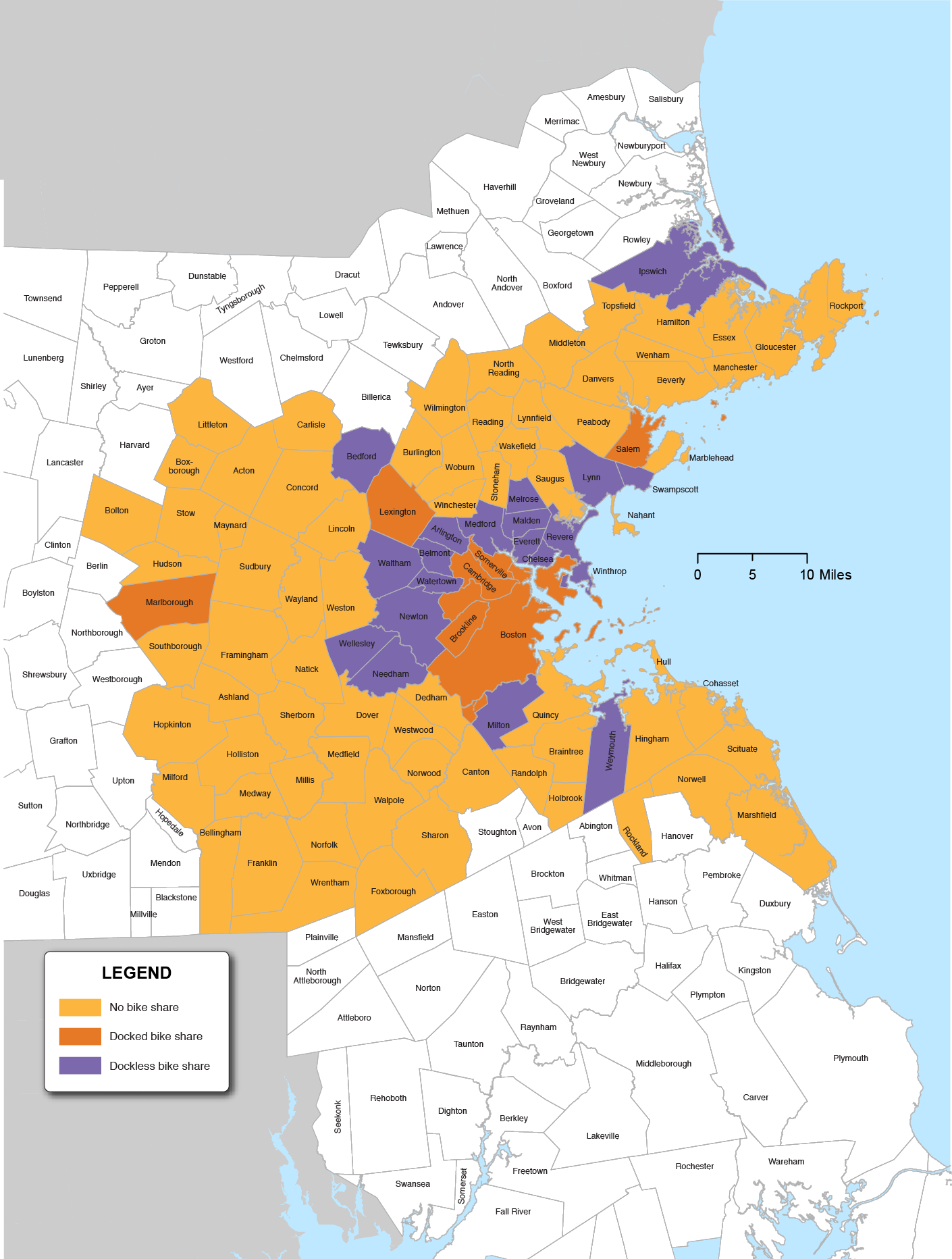
Source: Boston Region MPO.
In preparation of this Needs Assessment, it became clear that no planning entity holds detailed data on the presence, absence or status of sidewalks in the MPO region. According to data gathered for MassDOT’s Pedestrian Plan, 92 percent of sidewalks in the state are under municipal ownership, and MassDOT does not maintain pedestrian facility data of any type.37 Knowing where sidewalks are located or absent, and their condition is a key element in planning. These data could be a springboard for numerous other planning efforts, such as MAPC’s Local Access Score app, Safe Routes to School, and Safe Routes to Transit.38 A model for such an effort was recently completed by the Capital District Transportation Committee (the MPO serving the Capital District of New York State).39
There are several efforts underway to create a network of greenways (or bicycle and pedestrian infrastructure) serving parts of or the entire Boston region, including MassDOT’s Bay State Greenways, MAPC’s LandLine Network, and the Emerald Network, as proposed by the LivableStreets Alliance. The MPO will continue to monitor developments on greenways with the understanding that a potential greenway network would be a strong addition to the overall transportation network.
MPO staff received comments on the Capacity Management/Mobility goal area during outreach on needs from fall 2017 through spring 2018. The following is a summary of comments by theme.
Respondents overwhelmingly urged improvements to transit, biking, and walking infrastructure to serve equity populations (low-income and minority). People hoped to see a network of safe, connected, and well-maintained sidewalks and bikeways—both shared-use paths and on-road protected bike lanes. Intersections and timely snow clearance were noted as particularly important for safety.
As with other modes, the Boston region faces numerous policy and implementation challenges while planning for Destination 2040 with respect to its bicycle and pedestrian networks. Demand for such accommodations, particularly for those that are of high-quality and safest for users, is growing. While many people within the MPO region, and especially in its densest areas, live near a section of high-quality bicycle infrastructure, the various elements have yet to be stitched into a network that enables widespread mobility since bicyclists and pedestrians sometimes compete for street space with cars, trucks, and buses.
Reliable region-wide data on the presence and condition of sidewalks is scarce—a key issue for safe routes to school and access to transit. The MPO and other policymakers must grapple with region-wide coordination on this issue, as well as with the growth of bike-share in both its docked and dockless forms. In addition to providing a region-wide forum for coordination on issues, such as creating a network of pedestrian and bicycle infrastructure, the MPO can also provide cutting-edge research and technical analysis to assist municipalities and others in the integration of bicycle and pedestrian accommodations into the transportation network.
Since the MPO last updated its Needs Assessment in 2015, there have been several planning and policy changes that affect the content of this chapter:
In addition, the MPO has witnessed new trends in the region since the last Needs Assessment, which have affected this update. These trends include:
Updates have been made to this chapter based on these planning and policy changes, data availability, and other factors.
1 Representative articles in the Boston Globe include, “It’s not your imagination. Your Boston commute is getting worse,” (https://www.bostonglobe.com/metro/2018/03/25/not-your-imagination-your-boston-commute-getting-worse/J7SdMk5wwwLa3oQWplqGHN/story.html?event=event25) and “Your commute stinks because Greater Boston can’t fathom its own growth.” (https://www.bostonglobe.com/opinion/2018/03/28/your-commute-stinks-because-greater-boston-can-fathom-its-own-growth/9FMkxTCN2oT8nIdJ8TRXeO/story.html).
2 The CMP and Arterial applications can be viewed at http://www.bostonmpo.org/applications.
3 A precursor is a chemical compound that reacts with other chemical compounds in the presence of solar radiation to form pollutants.
4 Rhode Island was not included in the calculation of this measure because it does not include any portion of the Boston UZA’s NHS network. See FHWA’s Applicability Determination CMAQ Traffic Congestion and CMAQ On-Road Mobile Source Emissions Measures (23 CFR 490.707 and 490.807), and Change Log: Applicability Determination for CMAQ Measures, May 22, 2018.
5 US Census Bureau, American Community Survey, “Commuting Characteristics by Sex,” American Community Survey Five-Year Estimates, https://factfinder.census.gov/faces/tableservices/jsf/pages/productview.xhtml?pid=ACS_16_5YR_S0801&prodType=table; accessed September 2, 2018.
6 FHWA allows States and MPOs to measure non-SOV travel using ACS estimates of the percentage of workers who commute to work using modes other than driving alone (such as taking a carpool, vanpool, or public transit; bicycling; walking; or telecommuting); travel surveys that reveal mode choices; or sample or continuous counts of travelers using different modes.
7 To view this report, visit http://ctps.org/data/calendar/pdfs/2017/MPO_1019_Shared-Use_Mobility_LitReview.pdf.
8 This information is also published at https://tnc.sites.digital.mass.gov/.
9 To review this report, visit http://www.mapc.org/wp-content/uploads/2018/02/Fare-Choices-MAPC.pdf.
10 To review this report, visit http://www.mapc.org/wp-content/uploads/2018/06/Share-of-Choices-PDF_Edited.pdf.
11 As mentioned in Table 6-4, the Central Transportation Planning Staff (CTPS) is the staff to the Boston MPO. In addition to its work with the Boston MPO, CTPS works with and conducts studies for other transportation agencies in the state.
12 McCahill, Garrick, Atkinson-Palombo, and Polinski, 2015 (https://www.ssti.us/wp/wp-content/uploads/2016/01/TRB_2016_Parking_causality_TRB_compendium.pdf)
13 Shoup, 2007 (http://shoup.luskin.ucla.edu/wp-content/uploads/sites/2/2015/02/CruisingForParkingAccess.pdf)
14 Metropolitan Area Planning Council, 2017 (http://perfectfitparking.mapc.org/)
15 FHWA’s resource sheet on the topic lays out different options for congestion pricing, located here: https://ops.fhwa.dot.gov/publications/congestionpricing/sec2.htm.
16 Constraints are based on 2012–13 Inventory of Park-and-Ride Lots at MBTA Facilities, conducted by CTPS. See full memo here: https://www.ctps.org/data/pdf/programs/cmp/Park_and_Ride.pdf. The model uses these numbers as inputs.
17 Park-and-ride existing capacity numbers are taken from new counts conducted to update the 2012–13 Inventory of Park-and-Ride Lots at MBTA Facilities in 2018–2019; a memo including the full results has not yet been published.
18 For the MBTA update on parking prices, see https://www.mbta.com/projects/parking-prices-update.
19 Transit Signal Priority in the Boston Region: A Guidebook (MPO, December 2018): https://www.ctps.org/data/calendar/pdfs/2018/MPO_1220_Report_Transit_Signal_Priority_Guide.pdf
20 MBTA’s Data Blog. “Investigating Bus Ridership using Regression Analysis,” February 2018. http://www.mbtabackontrack.com/blog/79-bus-ridership-regression-model
21 Plan for Accessible Transit Infrastructure presentation to the MBTA FMCB, 4/1/2019 https://cdn.mbta.com/sites/default/files/fmcb-meeting-docs/2019/04-april/2019-04-01-fmcb-pati-original.pdf
22 The MBTA measures reliability at timepoints, using two separate tests. Scheduled-Departure Service: A trip is considered to provide scheduled-departure service when it operates with a headway longer than 15 minutes. For scheduled-departure services, passengers generally time their arrivals at bus stops to correspond with the specific published departure times. Frequent Service: A trip is considered to provide frequent service when it operates with a headway of 15 minutes or shorter. For frequent service, passengers can arrive at a stop without looking at a schedule and expect a reasonably short wait. Key bus routes, whose passengers use the services as if they were frequent services despite occasional longer than 15 minute headways, are always evaluated using the frequent service definition even when their headways exceed 15 minutes.
23 For MBTA-specific research, see Maltzan (2015) and Fabian (2017); for examples from other U.S. transit systems, see Pangilinan, Wilson, and Moore (2007), Berrebi, Watkins, and Laval (2015), and Berrebi et al (2017).
24 Core Capacity Constraints: Accommodating Growth on Greater Boston’s Congested Road and Crowded Transit System, Boston Region MPO, August 2016. http://ctps.org/core-capacity-constraints
25 A plan with origins in the 1960s to concentrate development in a spine of large towers from the Back Bay to the Financial District.
26 “Bus Crowding: Introduction” is located here: http://www.mbtabackontrack.com/blog/60-bus-crowding-introduction
27 “Service Delivery Policy Workshop,” held October 20, 2016. More information is located here: https://cdn.mbta.com/uploadedfiles/About_the_T/Board_Meetings/Service%20Delivery%20Policy%20-%20Final%20To%20Upload(2).pdf.
28 To view commuter rail counts, visit: https://www.mass.gov/lists/2018-commuter-rail-counts.
29 To view the Bicycle Plan, visit: https://massdot.maps.arcgis.com/apps/MapJournal/index.html?appid=c80930586c474a3486d391a850007694.
30 See for example: https://www.citylab.com/transportation/2014/06/protected-bike-lanes-arent-just-safer-they-can-also-increase-cycling/371958/.
31 “Development of a Scoring System for Bicycle Travel in the Boston Region,” Boston Region MPO (November 8, 2018), https://www.ctps.org/data/pdf/studies/bikeped/bicycle-level-of-service.pdf
32 High-quality bicycle infrastructure is defined as bicycle facilities that are physically separated (such as a vertical barrier between bicyclists), bicycle facilities at curb/sidewalk level that are accompanied by separation between bicyclists and pedestrians, or, in the case of shared-use paths, separate paths for bicyclists and pedestrians. Medium-quality bicycle infrastructure is defined as horizontally-separated bicycle facilities (such as paint-buffered bike lanes between motorists and bicyclists), bicycle facilities at curb/sidewalk level without a sidewalk buffer to separate bicyclists and pedestrians, or, in the case of shared-use paths, combined paths for bicyclists and pedestrians.
33 NACTO Bike-Share in the U.S., 2017. https://nacto.org/bike-share-statistics-2017/
34 “Is Pedal Dockless Bike Share Going Extinct?” StreetsBlog USA (2018), https://usa.streetsblog.org/2018/10/10/is-pedal-dockless-bike-share-going-extinct/.
35 “Electric scooters will come to Brookline this spring” The Boston Globe ( 2019), https://www.bostonglobe.com/metro/2019/03/13/electric-scooters-will-come-brookline-this-spring/gsx17BynebY7EdM8Kkap1I/story.html
36 Massachusetts Pedestrian Transportation Plan: https://massdot.maps.arcgis.com/apps/MapJournal/index.html?appid=96339eb442f94ac7a5a7396a337e60c0
37 Capital Planning Committee Meeting, June 5th, 2018, https://www.mass.gov/files/documents/2018/06/07/PedestrianPlanUpdate_060518.pdf.
38 Local Access Score by MAPC: http://localaccess.mapc.org/
39 CDTC’s Regional Sidewalk Inventory:http://www.cdtcmpo.org/images/bike_ped/CDTC_Regional_Sidewalk_Inventory_Report.pdf
< Chapter 5 - System Preservation and Modernization Needs | Chapter 7 - Clean Air and Sustainable Communities Needs >